
How to Build a High-Converting Shopify Product Page in 2026
Your product page is the most expensive real estate in your Shopify store. Every dollar you spend on Meta ads, Google Shopping, TikTok content, and SEO is funneling traffic toward one destination — and if that destination does not convert, the money spent getting people there is wasted. How to Build a High-Converting Shopify Product Page
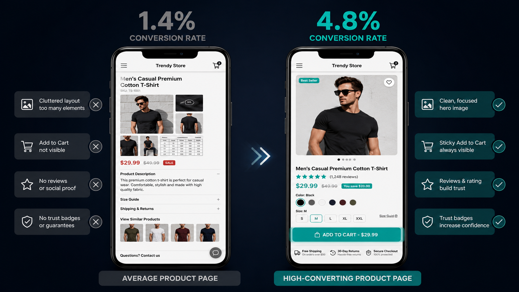
Most Shopify stores convert between 1.4% and 1.8% of product page visitors. Top-performing stores in competitive niches regularly hit 4% to 6%. Best-in-class direct-to-consumer brands reach 8% or higher on specific SKUs. The gap between those numbers is not luck, a bigger ad budget, or a better product. It is deliberate, systematic optimization of the elements that influence purchase decisions.
A 1% conversion lift on a product page receiving 10,000 monthly visitors at a $60 average order value means $6,000 in additional monthly revenue from zero additional traffic. Lift that same page from 1.8% to 2.7% and the math produces $5,400 in incremental monthly revenue permanently — from the same product, the same price, the same ad spend.
This guide covers every element of a high-converting Shopify product page in 2026, with real brand examples showing what each principle looks like when executed correctly. Use it as an audit for your existing pages and a build checklist for new ones.
Why Most Shopify Product Pages Underperform
Before building the optimized version, understanding the most common failure patterns prevents rebuilding the same mistakes into a new design.
The single most common product page failure is information mismatch — the visitor arrives with a question the page does not answer, and they leave rather than hunting for the answer elsewhere. That question might be about sizing, shipping time, how the product compares to alternatives, whether it works for their specific use case, or what other customers experienced.
The second most common failure is friction — required actions that are harder than they need to be. A variant selector that requires scrolling to find. An Add to Cart button that disappears as you scroll through the description. A checkout button that takes you to a login wall rather than a guest checkout. Each friction point costs a percentage of the visitors who reach it.
The third is trust deficit — pages that look unfinished, have sparse reviews, missing return policy information, or no visible contact method. A visitor who cannot answer the question "is this brand legitimate?" will not complete a purchase regardless of how good the product is.
Every element in this guide addresses one or more of these three failure patterns. The brands doing this well have not discovered exotic optimization secrets — they have executed consistently on a well-known set of principles across every product page in their catalog.
Element 1: Hero Image and Visual Gallery
Your first product image makes or breaks the page. It must answer one question instantly: is this the right product? That means a clean, high-resolution shot of the product itself — on a white or neutral background — with no lifestyle staging, no props, and no branding that competes for visual attention.
Lifestyle images belong in positions two through six in the gallery, not the hero. The reason is simple: the visitor has come from a specific search, ad, or recommendation with a product in mind. Their first action is visual confirmation. Show them the product, clearly, at the largest size your layout allows.
The optimal product image gallery in 2026 includes six or more images showing: the product from the front, back, and key angles; a close-up of the material, texture, or key feature; a scale reference that shows how large or small the product actually is; lifestyle images showing the product in use in context; and a size guide or measurement reference image for physical products where fit matters.
Gymshark executes this exceptionally well. Their product gallery for apparel consistently includes model shots from front and back, a fabric close-up, a detail shot of any unique technical feature, and a lifestyle shot showing the product being used in an actual gym environment. By the end of the gallery, a visitor has seen the product from every angle a reasonable buyer would want to check.
For brands with products where motion or function matters — kitchen tools, fitness equipment, skincare applicators — a 15 to 30 second autoplay video loop (muted, with captions for accessibility) embedded in position two of the gallery increases time on page and reduces return rates for customers who would otherwise misunderstand how the product works. Shopify supports video natively in the product media section — no third-party app required.
Element 2: Product Title and SEO Hierarchy
Your product title does two jobs simultaneously: it tells the visitor they have found the right product, and it tells Google what the page is about. In 2026, most Shopify product titles are optimized for neither.
The formula that serves both purposes is Brand + Product Name + Key Differentiator. For example: "Allbirds Tree Runner — Lightweight Wool Running Shoe for Men" rather than simply "Tree Runner" or "Running Shoe." The full title confirms what the product is, who it is for, and what makes it different — in a single line that serves as both a clear customer-facing header and a keyword-rich page title for search engines.
Place your primary keyword naturally in the H1 tag, which in Shopify is controlled by the product title field. Set a meta title and meta description in the SEO section of each product that accurately describes the product and includes the primary search term a buyer would use to find it. Shopify renders these for Google automatically — they just need to be written intentionally rather than left as defaults.
Element 3: Price Display and Perceived Value
The price is one of the first things every visitor looks for — and how you display it communicates as much as the number itself.
Best practices for price display in 2026: show the price in the largest, most visually prominent text above the fold. If there is a sale price, display both the original and reduced price with a clear discount percentage badge — "Save 25%" — rather than leaving the visitor to calculate the saving themselves. If you offer a subscribe-and-save discount, show both the one-time price and the subscription price side by side with the saving clearly labeled.
For products above $100, display any available BNPL (Buy Now Pay Later) installment options — Klarna, Afterpay, or similar — directly beneath the price. "Or 4 payments of $24.99 with Afterpay" at the point where the visitor first sees the price removes the affordability objection before it can form. The data on BNPL integration at the product page level consistently shows 15 to 20% higher add-to-cart rates for high-ticket products when installment options are visible.
Element 4: The Add to Cart Button — Your Most Important Design Element
Your Add to Cart button is the single most important design element on the product page. It should be impossible to miss and trivially easy to tap.
The button must be above the fold on both desktop and mobile — visible without scrolling from the moment the page loads. It should use a high-contrast color that stands out from the page's primary palette. On a white background store, a teal, black, or orange button converts better than a pale grey one. The button text should be action-oriented and clear: "Add to Cart," "Add to Bag," or "Buy Now" all perform consistently. Avoid generic text like "Continue" or "Proceed" that creates ambiguity about what will happen when clicked.
On mobile — which represents approximately 74 to 79% of your product page traffic — implement a sticky Add to Cart bar that follows the visitor as they scroll through the description. When the native ATC button is above the fold and the visitor scrolls down to read the description, the sticky bar ensures the action is always one tap away regardless of where they are on the page.
Gymshark, Allbirds, and SKIMS all implement sticky mobile ATC bars on their product pages. The lift from this single implementation typically runs 10 to 18% on mobile add-to-cart rate — making it one of the highest-ROI single changes available to any Shopify store.
Element 5: Benefit-Driven Product Description
The product description is where most Shopify stores make the same mistake: they describe features when customers are buying benefits.
Features describe what a product is and does. Benefits describe what a product does for the customer. A feature is "made with merino wool." A benefit is "stays odor-free for multiple wears so you can pack less and travel lighter." Both facts describe the same product. One gives the visitor a reason to care about the fact.
The two-layer description structure that converts best in 2026:
-
Layer one — a short emotive opening paragraph of three to four sentences that focuses on the transformation or benefit the customer will experience after buying. This is the emotional appeal that creates desire. It should be written in second person — "you" — and should speak directly to the problem the product solves.
-
Layer two — structured technical detail presented in bullet points or short sections covering materials and construction, dimensions and sizing, care instructions, compatibility information, and any certifications or ingredients. This satisfies the rational mind that has already been engaged by layer one.
SKIMS executes this structure precisely. Their product descriptions open with a short paragraph about how the product will make the customer feel, followed by clean bullet-point specifications covering fabric composition, coverage level, and size inclusivity. The emotional opener creates desire; the specification layer removes doubt.
For SEO, use your primary keyword naturally in the first paragraph of the description and incorporate two to three secondary keywords in the specification section. This structure satisfies both Google's content relevance requirements and the customer's need for information without forcing keyword density that reads artificially.
Element 6: Social Proof Architecture
Reviews are not just a trust signal — they are a conversion driver. A product with 50 or more reviews and a 4.3-star rating consistently outconverts an identical product with five reviews and a perfect 5-star rating. Buyers trust realistic, volume-verified ratings more than sparse perfection — because the volume of reviews signals that many people have bought and been satisfied.
The social proof architecture that works best in 2026 places elements at three points on the product page:
Above the fold: display the aggregate star rating and review count directly beneath the product title. This is visible on page load and immediately signals that the product has been bought and validated by other customers. The star rating at this position consistently reduces bounce rate because it answers the legitimacy question before the visitor has time to form doubt.
Mid-page: surface three to five highlighted reviews — your best, most specific, and most persuasive reviews — as a featured review block between the description and the technical specifications. These reviews should address the most common purchase objections. If customers frequently ask "does this run true to size?" feature a review that answers it directly.
Below the fold: the full review section with filtering, sorting, and the ability to read all reviews in full. Photo and video reviews embedded in this section — from customers who submitted images of the product in use — consistently increase conversion rates because they provide the visual social proof that product photography cannot replicate.
Element 7: Trust Signals at the Critical Moment
The critical moment on a product page is the ten to fifteen seconds after the visitor has finished reading the description and before they click Add to Cart. This is the decision window — and the trust signals you place in proximity to the ATC button directly influence whether the visitor converts or leaves.
The four trust signals with the highest conversion impact in close proximity to the ATC button are:
A free shipping threshold statement — "Free shipping on orders over $50" — that tells the visitor what their order will cost before they begin checkout. Visitors who reach checkout and discover shipping costs they did not know about abandon at high rates. Eliminating this surprise at the product page level removes the most common cause of checkout abandonment.
A return and guarantee statement — "30-day free returns, no questions asked" — that removes the financial risk of buying from a brand the visitor may not have purchased from before. The fewer purchases a visitor has made from your brand, the more impactful a strong return policy statement is at this position.
Payment security badges — Secure Checkout, Encrypted Payment, or SSL badge — that confirm the payment process is safe. First-time buyers who do not yet trust your brand are evaluating security risk at this moment. A visible trust badge addresses that evaluation directly.
Contact availability indicator — "We typically respond within 2 hours" or a live chat widget — that confirms real humans are behind the store. Faceless ecommerce sites generate more purchase hesitation than brands with visible, accessible customer support.
Element 8: Variant Selection and Size Guidance
Variant selection — color, size, material, style — is the most friction-laden element on most Shopify product pages, and it is almost never optimized.
The best practice for variant display in 2026 shows color options as image swatches rather than dropdown text menus. A dropdown that reads "Navy, Forest Green, Burgundy, Slate" requires imagination. A row of color swatches allows immediate visual selection at a glance. Every click saved in the variant selection process is a friction point eliminated.
For size variants, display sizing guidance — a size chart or measurement guide — immediately adjacent to the size selector, not buried at the bottom of the page or on a separate tab. A visitor who cannot answer "which size should I order?" without significant effort is a visitor who adds nothing to cart and leaves. Reducing sizing uncertainty at the variant selection point directly reduces return rates for products where fit matters.
If your product is out of stock in a specific variant, show that variant as greyed out rather than hiding it. Hidden sold-out variants make the product appear to have fewer options than it does. Greyed-out variants with a "Notify me when available" option preserve the full product presentation while capturing demand signals for inventory planning.
Element 9: Urgency and Scarcity — Used Honestly
Urgency and scarcity are the most overused and most abused conversion tactics on Shopify product pages — and the brands using fake scarcity are doing measurable damage to their conversion rates among informed shoppers who have learned to recognize it.
Authentic urgency and scarcity that converts in 2026:
Low stock indicators — "Only 8 left" — when inventory is genuinely limited to that number. Shopify allows you to display inventory counts natively, or through apps like Scarcity Pro and HurryTimer. Visitors who see a real inventory count understand the information as genuine. Visitors who see "Only 3 left!" on a product that has been showing "Only 3 left!" for six weeks have learned to ignore it.
Shipping cutoff timers — "Order within 3 hours 24 minutes for delivery by Thursday" — that communicate real logistics timelines. These work particularly well for gift purchases and time-sensitive needs. They should reflect your actual fulfillment and carrier schedules, not arbitrarily chosen numbers.
Recently sold counters — "47 people bought this in the last 24 hours" — that reflect real sales data rather than inflated numbers. Some Shopify apps pull this data directly from your order history. When the number is real, it functions as social proof and urgency simultaneously.
Element 10: Product Recommendations and Upsell Placement
The product page is not just a conversion point — it is also a revenue-expansion opportunity for customers who will buy but might buy more or buy better.
Frequently Bought Together — a block showing products that other customers purchased alongside this one — typically appears beneath the description or just above the review section. When the recommendations are genuinely complementary rather than randomly assorted, this block adds 8 to 15% to average order value from customers who engage with it.
You May Also Like — an alternative or upgraded version of the product being viewed — serves a different function. It captures customers who are interested in the category but undecided about this specific product by showing them alternatives. For higher-priced variants of the same product, this can lift average order value significantly.
Rebuy is the leading product recommendation app for Shopify in 2026, powering Frequently Bought Together, post-cart upsells, and on-page cross-sell blocks with AI-driven matching that outperforms manually curated recommendations for most catalogs.
The Above-the-Fold Hierarchy That Converts
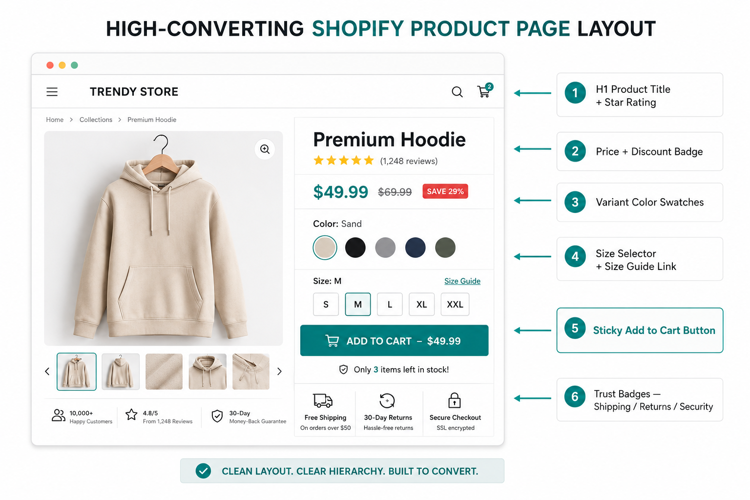
Every element covered in this guide matters — but the prioritization of what a visitor sees without scrolling determines how quickly they reach the purchase decision. The above-the-fold layout on a high-converting Shopify product page in 2026 follows this hierarchy from top to bottom:
Product title in H1 with star rating and review count immediately beneath it. Hero image on the left at maximum display size. Price, variant selector, and Add to Cart button stacked vertically on the right. Beneath the ATC button: shipping information, return policy, and two to three trust badges. Nothing else above the fold that competes with this purchase decision path.
Everything below the fold — description, feature callouts, social proof, recommendations — deepens the relationship for visitors who need more information before buying. The above-the-fold layout converts the visitors who need no additional convincing. The below-the-fold content converts everyone else.
Real Brand Examples: What Best-in-Class Looks Like
Allbirds product pages are the most consistently cited example of best-in-class Shopify product page execution. Their above-the-fold layout matches the hierarchy described above precisely. Their descriptions open with emotional benefit language before moving to technical specifications. Their review section is deep, includes photos, and filters by verified purchase. Their variant swatches are large, clearly labeled, and accompanied by a size guide that opens as an overlay rather than a new page.
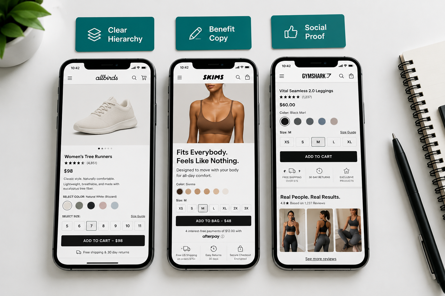
SKIMS builds its product pages around the customer's emotional relationship with the product. Headline and subheadline on the hero image carousel speak directly to how the product will make the customer feel. Reviews are prominently placed and specifically selected to address fit and comfort — the primary purchase hesitations for shapewear. The ATC button is sticky on mobile throughout the scroll.
Gymshark provides the most complete example of UGC integration on product pages. Customer photos are displayed within the review section alongside text reviews, and a dedicated section shows real customers wearing the product at different body types — addressing the most common concern for activewear ("will this look good on me?") more effectively than any professionally styled product shot.
None of these brands is doing anything technically complex or requiring expensive custom development. They are executing a consistent set of well-known principles — clear visual hierarchy, benefit-driven copy, prominent social proof, honest urgency, and frictionless add-to-cart — with precision and consistency across their entire product catalog.
Your Product Page Audit Checklist
Use this to score your current product pages against the 2026 standard:
Hero image is the product on a clean background, high resolution, with multiple gallery angles — yes or no. Product title includes brand, product name, and key differentiator — yes or no. Price is displayed prominently above the fold with any discount clearly shown — yes or no. Add to Cart button is above the fold, high contrast, and sticky on mobile — yes or no. Description opens with benefit language before feature specifications — yes or no. Star rating and review count are visible above the fold — yes or no. Featured reviews are displayed mid-page addressing common objections — yes or no. Shipping, return policy, and trust badges appear near the ATC button — yes or no. Variant swatches are visual rather than text dropdowns — yes or no. Size guide is accessible adjacent to the size selector — yes or no. Frequently Bought Together recommendations appear below the description — yes or no. Page loads in under 3 seconds on mobile — yes or no.
Every "no" on this checklist is a revenue gap. Prioritize fixes based on traffic volume — the highest-traffic product pages generate the largest absolute return from the same percentage conversion improvement.
Final Thoughts
A high-converting Shopify product page is not the result of clever design or expensive development work. It is the result of consistent execution of a well-understood set of conversion principles — applied deliberately to every product page in your catalog and refined continuously based on performance data.
The brands generating 4% to 8% conversion rates on their product pages are not doing anything fundamentally different from what is described in this guide. They are doing it more completely, more consistently, and with more attention to the specific details that convert the specific customers in their specific category.
Audit your top ten highest-traffic product pages against the checklist above. The gaps you find are your optimization roadmap. Implement the fixes in order of potential revenue impact — typically starting with sticky mobile ATC, hero image quality, above-the-fold trust signals, and review count — and measure conversion rate by device before and after each change.
Product page optimization is not a one-time project. It is a systematic discipline that compounds in value with every percentage point of conversion improvement applied to every visitor your store receives.
Need help redesigning your Shopify product pages for maximum conversion, or want an expert audit of your current store's conversion rate gaps? Get in touch with EcomFixify — we specialize in Shopify development and conversion rate optimization for growing brands.
You may need to read More
Shopify Speed Optimization: The Complete Checklist for 2026
How to Use User-Generated Content to Increase Shopify Conversions