
Shopify Mobile Optimization: Why 79% of Your Traffic Isn't Converting
Shopify Mobile Optimization: Why 79% of Your Traffic Isn't Converting
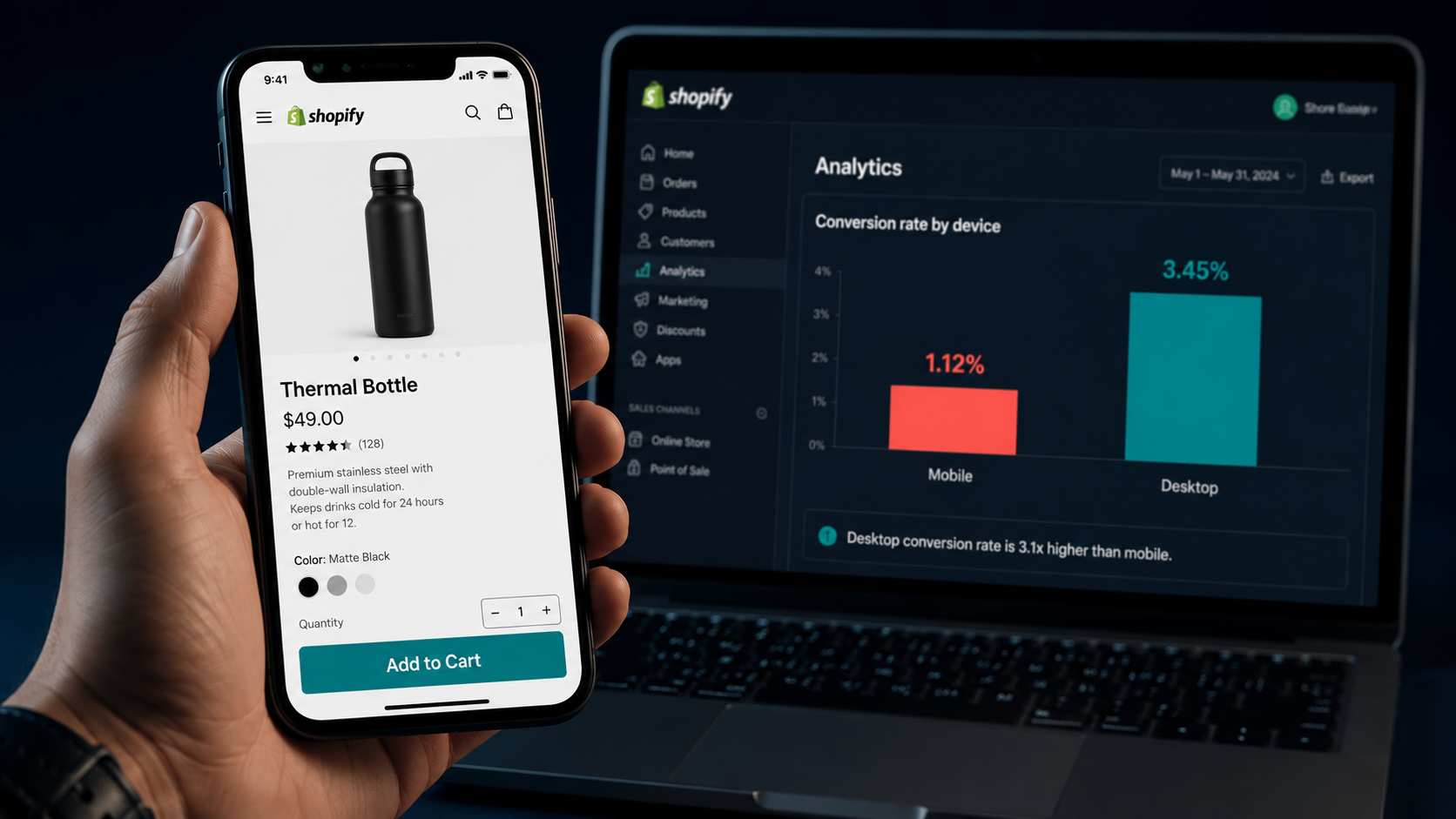
Here's a number that should stop every Shopify store owner cold: approximately 79% of your store's traffic is arriving on a mobile device right now. And the average mobile conversion rate across Shopify stores in 2026 is 1.2%.
That means for every 100 people walking through your mobile storefront, fewer than two are buying anything.
Meanwhile, your desktop conversion rate is likely sitting somewhere between 1.9% and 3.2% — more than double. Same products. Same prices. Same traffic sources. But the moment someone switches from a laptop to a phone, their likelihood of actually completing a purchase drops by 50–60%.
That gap isn't a mystery. It's a fixable engineering and design problem — and it represents the single largest untapped revenue opportunity for most Shopify stores in 2026.
This guide breaks down exactly why mobile visitors aren't converting, what the data says about the biggest friction points, and the specific changes that close the gap most effectively.
The Mobile Conversion Crisis in Numbers
Before diving into fixes, it's worth understanding the full scale of the problem — because most store owners are still benchmarking their overall conversion rate without separating it by device, which means they're missing where their real losses are happening.
<cite index="11-1">In 2026, approximately 74–78% of all Shopify store visits come from mobile devices, up from 69% in 2023. Mobile revenue share sits at 55–62% of total store revenue. The average mobile conversion rate is 1.4–2.0%, compared to 3.2–4.1% on desktop. Mobile cart abandonment averages 78–82%, versus 68–72% on desktop.</cite>
<cite index="12-1">Mobile devices account for approximately 79% of total traffic to Shopify stores, emphasizing the critical need for mobile optimization in ecommerce strategies.</cite>
<cite index="13-1">Closing even half of the mobile-desktop conversion gap — from 1.2% to 2.15% mobile — would increase total store revenue by approximately 40% from the same traffic.</cite>
Read that last stat again. A 40% revenue increase from the same traffic, with zero additional ad spend, simply by making your mobile experience work better. That's not a marginal improvement — it's a structural change in how much money your store generates every month.
<cite index="14-1">For a store with 50,000 monthly mobile visitors and a $90 average order value, the gap between a bottom-25% mobile conversion rate of 0.9% and a top-25% rate of 2.6% represents $76,500 per month in additional revenue.</cite>
Why Mobile Visitors Don't Convert: The Real Reasons
The gap between mobile traffic and mobile conversions isn't because phone users don't want to buy. It's because most Shopify stores were designed desktop-first and then responsively scaled down — which is not the same as being designed for mobile.
<cite index="19-1">The gap isn't because mobile shoppers don't want to buy. It's because most Shopify themes still treat mobile as a shrunk-down desktop instead of a completely separate experience. Common friction points include slow-loading product images, checkout forms designed for full-size keyboards, hidden add-to-cart buttons below the fold, and forced account creation before purchase.</cite>
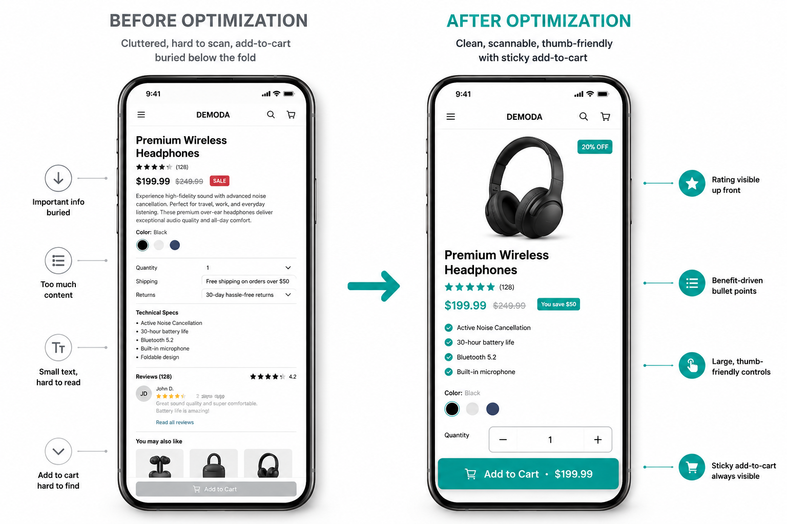
Breaking that down into its specific components:
Slow load times. <cite index="11-1">The average mobile page load time for Shopify stores is 4.2 seconds. Every additional second of load time reduces mobile conversion rates by 7–12%.</cite> A store loading in 4.2 seconds is losing a significant percentage of would-be customers before they even see a product.
Buried add-to-cart buttons. On desktop, the ATC button stays visible as you scroll through product details. On mobile, it disappears the moment a shopper scrolls past the hero image — and most don't scroll back up to find it.
Checkout friction. Filling out a full name, email, shipping address, and payment details on a mobile keyboard is genuinely painful. Every additional field in the checkout flow costs you a percentage of completions.
No express payment options. <cite index="11-1">Implementing Apple Pay and Google Pay reduces mobile cart abandonment by 12–18%.</cite> These allow shoppers to complete a purchase with a single tap using saved credentials — eliminating the entire form-filling process.
Unreadable product pages. Small text, wide images that require horizontal scrolling, product descriptions written in dense paragraphs — all of these create friction that makes a mobile shopper give up rather than fight through to purchase.
Non-thumb-friendly tap targets. <cite index="13-1">Thumb-friendly CTA buttons with a minimum 48x48 pixel size increase mobile tap accuracy by 30%.</cite> Buttons that are too small, too close together, or positioned in hard-to-reach screen areas directly reduce conversion.
The 7 Highest-Impact Mobile Optimization Fixes
These aren't theoretical suggestions. Each one has documented conversion lift data behind it and can be implemented without a full store rebuild.
1. Add a Sticky Add-to-Cart Bar
This is the single highest-ROI change available to most Shopify stores. <cite index="16-1">The most impactful single change for mobile conversion rate is installing a sticky Add to Cart button — a persistent CTA bar that remains visible as users scroll through product pages. On mobile, the native Shopify ATC button is often buried at the top of the page, requiring users to scroll back up to purchase. Keeping it always visible eliminates this friction and delivers 10–15% mobile conversion rate improvement.</cite>
<cite index="11-1">Stores using a sticky add-to-cart see 12–18% higher mobile conversion rates because the add-to-cart button remains visible as shoppers scroll through product details.</cite>
This requires either a Shopify app or a theme with a native sticky ATC feature. Several free and low-cost options exist in the Shopify App Store. It's consistently the first change we recommend to any merchant whose mobile conversion rate is underperforming.
2. Improve Mobile Page Speed
<cite index="19-1">Every one-second delay in mobile load time drops conversions by roughly 7%. On a store doing $1 million in annual revenue, that one-second lag costs around $70,000 a year.</cite>
The primary levers for mobile speed on Shopify:
- Convert images to WebP format — WebP images are 25–35% smaller than JPEG at equivalent quality, dramatically reducing load time for image-heavy product pages - Implement lazy loading — load images only as they enter the viewport rather than all at once on page load - Audit and remove unnecessary apps — every installed Shopify app adds JavaScript to your storefront; apps you're not actively using are pure page speed cost - Use a performance-optimized theme — themes like Dawn, Impulse, and Prestige are built with Core Web Vitals in mind; heavily customized older themes often accumulate technical debt that crushes mobile speed
<cite index="11-1">Stores using performance optimization tools typically achieve 1.8–2.5 second load times and see 15–25% improvements in mobile conversion rates.</cite>
Check your current mobile speed in Google PageSpeed Insights and aim for a Largest Contentful Paint (LCP) under 2.5 seconds. That's the threshold Google defines as "good" and the threshold where mobile conversion rates see the most significant improvement.
3. Enable Express Checkout Options
<cite index="13-1">Shop Pay and express checkout options reduce mobile checkout time by 60%.</cite>
Shop Pay, Apple Pay, and Google Pay allow returning customers to complete a purchase in a single tap — no form filling, no card number entry, no billing address lookup. For new customers, the friction reduction is still significant because these payment methods auto-populate shipping and payment details from saved credentials.
<cite index="14-1">Enabling Shop Pay reduces checkout abandonment by 5–10% on average. Offering express checkout options adds another 3–5% lift for mobile users.</cite>
In Shopify admin, go to Settings → Payments and enable all accelerated checkout options. Make sure they appear prominently on both the product page and the cart page, not just in the checkout flow — the earlier a shopper can commit to a one-tap purchase, the better.
4. Redesign Product Pages for Mobile Scannability
<cite index="20-1">Mobile users scroll quickly and make decisions faster. Keep key actions like the Add to Cart button visible early, and format content using collapsible sections, bullets, and short blocks. This improves clarity and keeps high-intent shoppers moving forward.</cite>
A well-structured mobile product page in 2026 follows this sequence from top to bottom:
- Product title and star rating (visible immediately on load)
- Price, including any sale price or bundle discount
- Hero product image with swipe-enabled gallery
- Sticky ATC bar (visible throughout scrolling)
- Key benefit bullets — 3 to 5 short lines, not paragraphs
- Size/variant selector
- Social proof — a featured review or review count with rating
- Collapsible accordion sections for full product description, shipping, and return policy
Everything secondary to the purchase decision — detailed specs, full description, cross-sells — goes below the fold in collapsible sections that don't slow the page or distract from the primary action.
5. Simplify Your Mobile Checkout
<cite index="19-1">Fewer form fields, guest checkout enabled, and express payment options are table stakes in 2026.</cite>
Specific changes that reduce mobile checkout abandonment:
- Enable guest checkout — forcing account creation before purchase is one of the most documented causes of checkout abandonment across all devices, but especially on mobile where the friction is amplified - Remove unnecessary checkout fields — if you don't need a phone number, don't ask for it; every extra field costs you a percentage of completions - Show shipping cost early — <cite index="14-1">stores that display free shipping thresholds prominently on product pages see 8–12% higher conversion than stores that hide shipping costs until checkout</cite> - Add a progress indicator — showing "Step 1 of 2" in the checkout flow reduces abandonment by reassuring shoppers the process is nearly complete
6. Optimize Navigation for Thumbs
Mobile shoppers navigate with their thumbs, and most store navigation is built for mouse pointers. A menu that requires precise tapping on small links, filter options that are difficult to activate, or a search bar that's buried in a corner creates friction before a shopper even reaches a product page.
<cite index="20-1">Use large, tappable links with clear labels. Remove or deprioritize low-conversion links. Focus the menu on what drives sales — product categories, delivery info, current promotions, and help.</cite>
The mobile menu should surface your highest-converting categories first. If "Sale" and "New Arrivals" drive the majority of your mobile purchases, they should appear at the top of the navigation — not buried beneath corporate pages and policy links.
7. Place Social Proof Where Mobile Shoppers See It
Reviews and trust signals don't help if they're hidden below the fold. <cite index="20-1">Place ratings and review counts near the product title or price so users see them before they scroll. Highlight specific quotes, verified buyer badges, or user-generated content like photos and videos. UGC can increase conversion rates by up to 28%.</cite>
On mobile specifically, a star rating and review count positioned directly beneath the product title — visible on initial load without any scrolling — meaningfully reduces purchase hesitation for first-time visitors. Photo reviews from real customers showing the product in use are particularly effective on mobile because they're fast to consume and immediately relatable.
How to Diagnose Your Specific Mobile Conversion Problem
Before applying all seven fixes at once, it's worth identifying which specific issue is costing you the most conversions. Different problems produce different symptoms in your analytics.
Check your mobile bounce rate. <cite index="11-1">Mobile bounce rates average 47–55%, compared to 35–42% on desktop.</cite> If your mobile bounce rate significantly exceeds 55%, the problem is likely page speed or a disconnect between your ad creative and your landing page — visitors are leaving before they even evaluate the product.
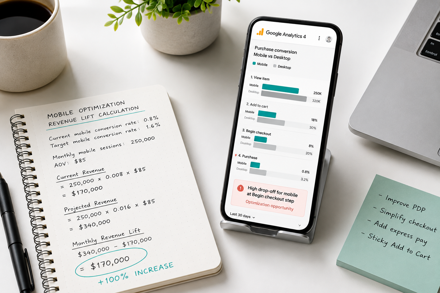
Check your add-to-cart rate by device. In Google Analytics 4, segment your add-to-cart events by device category. If mobile add-to-cart rate is close to desktop but mobile purchase rate is much lower, the problem is in checkout friction. If mobile add-to-cart rate is dramatically lower than desktop, the problem is on the product page itself.
Check your checkout abandonment rate. <cite index="11-1">Mobile cart abandonment averages 78–82%. The primary drivers are difficult checkout forms on small screens, slow page loads, unexpected shipping costs, and lack of mobile payment options.</cite> If you see high checkout initiation but low completion, simplifying the checkout flow and adding express payment options should be your first priority.
Run a real device test. Open your store on an actual smartphone — not a browser's mobile emulation mode — and walk through the complete purchase journey. You will notice friction points within the first two minutes that no analytics tool will show you. This remains the fastest and most effective mobile UX audit available.
What the Top-Converting Mobile Stores Do Differently
<cite index="16-1">Top-converting stores load in under 2 seconds on mobile. They have eliminated unnecessary apps, optimized images in WebP format with lazy loading, and minimized JavaScript.</cite>
Beyond speed, the patterns that distinguish top-performing mobile stores from average ones are consistent:
They treat mobile as a first-class experience, not a responsive fallback. Every design decision — button size, content hierarchy, image dimensions, navigation structure — is made with a thumb-operated 6-inch screen as the primary context, not a 27-inch monitor.
They remove everything that doesn't serve the purchase decision. Mobile screens are small and attention spans are shorter on mobile than desktop. Every element on a mobile product page that doesn't directly move a shopper toward adding to cart is a distraction that costs conversions.
They make the path to purchase frictionless at every step. One-tap payment options, guest checkout, pre-populated shipping forms, visible trust signals, and a persistent ATC button combine into a purchase experience that requires minimal effort from the shopper — and minimum effort is what mobile commerce demands.
The Revenue Math on Mobile Optimization
<cite index="15-1">If your store gets 70% mobile traffic and your mobile conversion rate is half your desktop rate, improving the mobile checkout experience alone could increase total revenue by 20–35%.</cite>
For a store generating $30,000 per month in total revenue, a 25% lift from mobile optimization is $7,500 per month — $90,000 per year — from zero additional traffic and zero additional ad spend.
The changes required to achieve that aren't a complete rebuild. A sticky ATC bar, WebP image conversion, Shop Pay activation, express checkout placement, and a streamlined mobile product page layout are implementable in days, not months. Some can be done in hours.
<cite index="19-1">Most stores see measurable improvement within 30–60 days if they focus on high-impact changes: checkout optimization, mobile speed, and trust signals.</cite>
Your mobile traffic isn't the problem. Your mobile experience is. And fixing it is the highest-leverage investment available to most Shopify stores right now.
Want an expert to audit your Shopify store's mobile experience and identify exactly where you're losing conversions? Get in touch with EcomFixify — we specialize in Shopify performance optimization and conversion rate improvement for growing brands.