
Shopify Design Psychology: The Science Behind Stores That Convert
Most Shopify merchants believe their store design is doing its job if it looks good. Clean theme, professional logo, attractive product photos — that should be enough to convert visitors, right?
The data says otherwise.
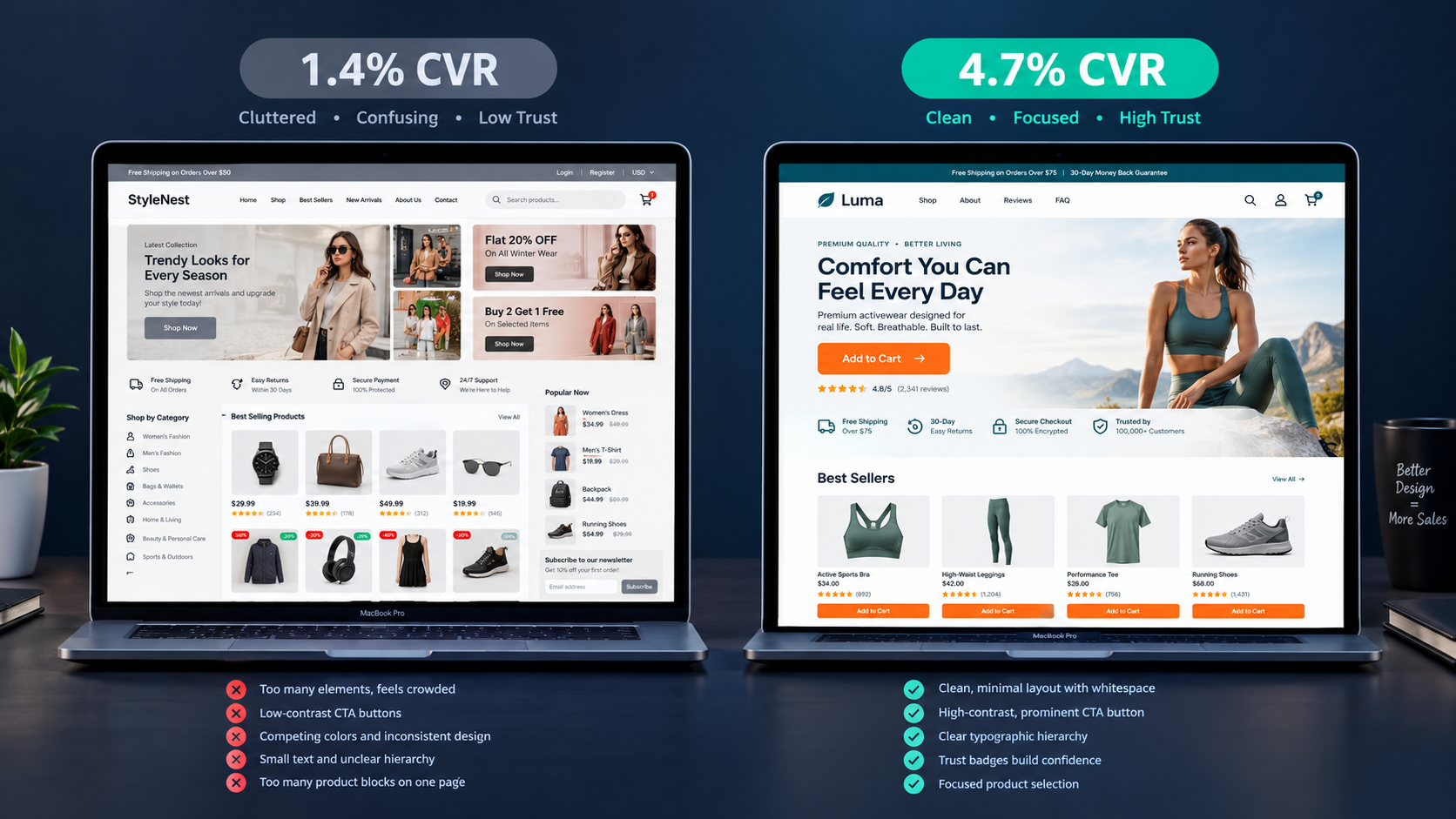
The average Shopify store converts at 1.4%. Stores that optimize their design with deliberate psychological intent consistently hit 3.2% to 4.7% — placing them in the top 20% of ecommerce retailers globally. On 50,000 monthly visitors with a $60 average order value, the difference between a 1.4% and a 3.5% conversion rate is $63,000 per month in additional revenue — from the same traffic, the same products, and the same prices.
That gap is almost never explained by aesthetics. It is explained by decision architecture — the way your design guides visitors through a psychological journey from uncertainty to purchase. The colors you use influence how visitors feel. The fonts you choose communicate trustworthiness or its absence. The layout determines whether the path to purchase is obvious or obscured. And most Shopify merchants are making all three of these decisions by gut feel rather than by the documented psychological principles that govern how humans respond to visual information.
This guide covers the design psychology principles that actually move conversion rates — with specific, implementable guidance for every element of your Shopify store.
Why Beautiful Design and High-Converting Design Are Different Things
The most common and most expensive mistake in Shopify store design is confusing aesthetics with conversion performance. A store can be visually stunning and functionally poor at the same time — and the market does not reward beauty. It rewards frictionless purchase decisions.
Beautiful design without a conversion strategy is expensive decoration that does not drive sales. The stores built to impress rather than convert focus on aesthetics over decision architecture — the structural and psychological elements that actually influence whether a visitor buys.
The practical implication is that every design decision — color choice, font selection, layout structure, whitespace allocation, image sizing — should be evaluated against one question: does this make it easier or harder for a visitor to make a purchase decision? Design elements that look appealing but slow the page, distract from the primary call to action, or add visual complexity without adding clarity are net negative conversion contributors regardless of how polished they appear.
This does not mean Shopify stores should be ugly or utilitarian. It means that design choices should serve the conversion funnel first and aesthetic sensibility second — and that the most beautiful Shopify stores in 2026 are the ones that look premium while simultaneously making it extraordinarily easy to buy.
Color Psychology: How Your Palette Influences Purchase Behavior
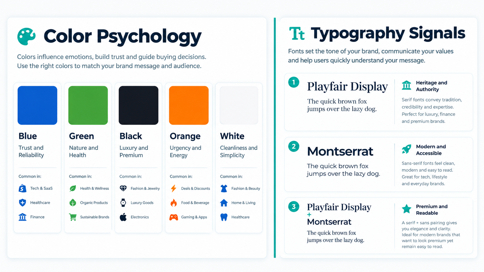
Color is not decoration. In ecommerce, color is an instruction — a set of signals that tell your visitor where to look, what to feel, and what to do. Getting the color psychology right does not require a design degree. It requires understanding three specific color applications that directly influence conversion.
CTA Button Color: The Most Important Color Decision in Your Store
Your call-to-action button — Add to Cart, Buy Now, Get Started — is the most commercially important element on every page it appears. The color of that button determines how quickly and how reliably visitors notice it — and noticeability is the prerequisite for every conversion.
The principle is contrast, not a specific color. Your CTA button must stand out from everything surrounding it. If your store uses a blue or navy palette, an orange or coral button creates immediate visual contrast that draws the eye. If your store uses warm neutrals and beige tones, a deep teal or forest green button creates the contrast required. If your store uses a white and grey palette, almost any saturated color — teal, cobalt, burnt orange — creates the contrast that makes the button unmissable.
Orange and green CTA buttons consistently outperform blue and grey in ecommerce A/B tests not because those colors are inherently superior but because they create stronger contrast against the neutral and blue palettes that dominate most Shopify themes. The rule is not "use orange." The rule is "create contrast."
Red buttons perform well for urgency-driven contexts — flash sales, limited stock alerts, countdown timer pages — because red triggers an urgency response that reinforces time-limited messaging. For standard product pages without active urgency mechanics, red can feel alarming rather than persuasive.
Color Psychology by Brand Category
Different product categories benefit from different color palettes because customers bring different expectations and emotional associations to different buying contexts.
Blue communicates trust, reliability, and calm — which is why financial services, health products, and baby brands lean toward it. Shopify stores selling supplements, wellness products, or products where safety and efficacy are the primary purchase motivation benefit from blue as their primary brand color.
Green communicates nature, health, and ethical sourcing — making it the natural choice for sustainable brands, organic products, and eco-conscious positioning. Allbirds uses green accents throughout its branding to reinforce its environmental story without making it the center of every product page.
Black communicates luxury, exclusivity, and premium positioning — signaling that a product is sophisticated and high-end. Gymshark's dark palette positions the brand as serious and aspirational. SKIMS' use of neutral blacks and beiges signals inclusivity and elegance simultaneously.
White and neutral tones communicate cleanliness, simplicity, and trust — making them the dominant choice for beauty, skincare, and minimalist brands where the product's visual quality speaks for itself and the background should not compete.
The most common color mistake in Shopify stores is using too many colors simultaneously. A store with five different accent colors creates visual noise that makes it impossible to direct attention toward the actions that matter. The discipline of one primary brand color, one accent color for CTAs, and neutral backgrounds for product content is not a creative limitation — it is the structure within which effective design operates.
Whitespace: The Color You Are Not Using Enough Of
Whitespace — the empty space between and around design elements — is the most consistently underused design tool in Shopify stores. Merchants fill every pixel, afraid that empty space looks unfinished. The psychological reality is the opposite.
Whitespace directs attention by removing competition. A product image surrounded by generous whitespace draws the eye more powerfully than the same image crowded by adjacent elements. A CTA button with whitespace above and below it stands out as a distinct action rather than blending into a dense content block. Apple's product pages are the extreme version of this principle — vast areas of white space that make every product feel important and every call to action feel unmissable.
For Shopify stores, the practical application is increasing the padding around your most important elements — your hero product images, your Add to Cart buttons, your product titles — and reducing the visual density of secondary content blocks. The visitors who need more information can scroll to find it. The visitors who are ready to buy should never have to search for the button.
Typography Psychology: How Fonts Signal Trust, Quality, and Brand Identity
Fonts are the voice of your Shopify store. Before a visitor reads a single word, the typeface has already communicated something about your brand — and that communication either builds or erodes the trust required for a purchase decision.
Serif vs. Sans-Serif: The Trust Signal in Your Font Choice
Serif fonts — those with the small strokes or feet at the end of letterforms, like Times New Roman or Garamond — communicate tradition, heritage, and authority. They are the fonts of newspapers, law firms, and luxury fashion houses. For Shopify brands positioning toward premium, established, or heritage-associated products, a serif font in headings communicates gravitas and credibility that younger sans-serif fonts cannot replicate.
Sans-serif fonts — clean letterforms without the strokes, like Inter, Helvetica, or Futura — communicate modernity, accessibility, and clarity. They are the dominant choice in technology, DTC brands, and contemporary lifestyle products because they feel current and approachable. Shopify's own Dawn theme uses Inter — a carefully engineered sans-serif designed for optimal screen readability.
The hybrid approach used by many high-converting Shopify stores in 2026 pairs a serif font for headings and hero text — establishing premium authority — with a sans-serif body font for product descriptions and UI elements — maintaining readability and modernity. Allbirds uses this exact pairing, with editorial serif headings that give the brand a considered, thoughtful feel alongside clean sans-serif product copy that is easy to scan.
Font Size Hierarchy: The Reading Path That Converts
Visual hierarchy in typography is the system of relative font sizes that tells visitors what to read in what order — and it directly influences how quickly they reach the information they need to make a purchase decision.
The three-tier hierarchy that works consistently in Shopify product pages operates as follows:
The headline — product name, hero section heading — is your largest text, typically 28 to 48 pixels on desktop and 22 to 32 on mobile. It answers the question "what is this?" before any other question can be asked.
The subheadline — key benefit statement, price, variant selector — is your medium text, typically 16 to 24 pixels. It answers the question "why should I care?" or "how much does it cost?" — the second and third questions every product page visitor is asking.
The body — product description, specification details, shipping information — is your smallest text, typically 14 to 16 pixels. It answers all further questions for visitors who need more information before buying, without competing with the headline and subheadline for initial attention.
The mistake most Shopify stores make in typography is inconsistent hierarchy — using similar font sizes for elements that deserve different visual weight, creating a flat reading experience where nothing has natural priority. When everything looks equally important, nothing does.
Readability Rules That Protect Your Conversion Rate
Beyond the psychological associations of specific fonts, the readability of your store's text directly determines whether visitors process your content or abandon the effort.
Line length — the number of characters per line in body text — should sit between 60 and 75 characters for optimal reading comfort. Lines shorter than 60 characters feel choppy and interrupted; lines longer than 75 characters cause eye fatigue as readers track across wide columns. For Shopify product descriptions, this typically means a content column width of 550 to 700 pixels on desktop.
Line height — the vertical space between lines of text — should be 1.5 to 1.7 times the font size for body text. Text with insufficient line height feels dense and difficult; text with excessive line height loses the visual connection between lines that supports comprehension.
Contrast between text and background is a readability and trust issue simultaneously. Dark text on a light background is not just a convention — it is the configuration the human visual system is optimized to process with least effort. Light grey text on a white background, a combination common in minimalist Shopify themes, reduces readability sufficiently to measurably increase bounce rates among visitors who encounter dense product descriptions in low-contrast formats.
Layout Psychology: The Design Structure That Guides Visitors Toward Purchase
Layout is the architecture of your Shopify store — the structure that determines which elements visitors encounter, in what sequence, and with what visual emphasis. Unlike color and typography, which influence how visitors feel, layout influences what they do.
The F-Pattern and Z-Pattern: How Visitors Actually Read Your Store
Eye-tracking research has documented two dominant visual scanning patterns that visitors use when they encounter a web page for the first time.
The F-pattern describes how visitors scan content-heavy pages — a full horizontal scan across the top, a second partial scan slightly lower, and then a vertical scan down the left edge of the page. Product description pages, blog posts, and collection pages where text plays a significant role follow this pattern. The practical implication: the most important information on these pages should be in the first line of text, in the first line of the second paragraph, and along the left margin of the content column.
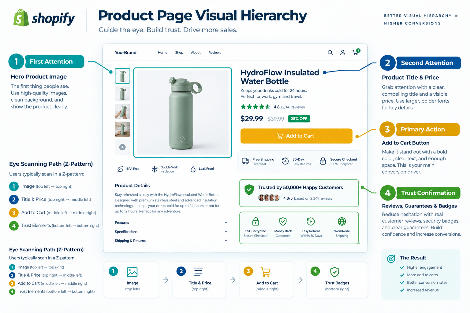
The Z-pattern describes how visitors scan simple, low-text pages — a horizontal scan across the top left to top right, a diagonal movement down to the bottom left, and another horizontal scan to the bottom right. Homepage hero sections, landing pages, and checkout confirmation pages follow this pattern. The practical implication: place your logo or brand name at the top left, your navigation at the top right, your primary value proposition or key visual in the middle, and your primary CTA at the bottom right — exactly the path the visitor's eye naturally travels.
Most Shopify homepage designs violate the Z-pattern by placing CTAs in locations the visitor's eye does not naturally reach without redirecting from their default scanning path. The stores that convert best have internalized where visitors look without thinking — and placed their most important actions at exactly those coordinates.
Visual Hierarchy in Layout: Directing Attention Without Instructions
Visual hierarchy in layout uses size, contrast, position, and whitespace to direct visitor attention without requiring any cognitive effort from the visitor. The hierarchy works subconsciously — visitors follow it without knowing they are being guided.
The elements that deserve the highest position in your Shopify layout's visual hierarchy are: the hero product image on product pages, because visual confirmation of the product is the first need of every visitor; the product title and price, because they answer the identity and cost questions that determine whether the visitor stays; the Add to Cart button, because it is the action the entire page exists to prompt; and social proof — star rating, review count — because it answers the trust question before the rational mind asks it.
Elements that serve secondary functions — product description detail, specification tables, FAQ sections, related products — belong lower in the hierarchy and should be visually subordinate to the primary conversion elements. Accordions and collapsible sections that contain this secondary information on demand — without displaying it by default — reduce visual density on the page without hiding information from visitors who need it.
Navigation Design: The Invisible Influence on Conversion Rate
Your navigation structure is the map of your store — and a confusing map loses visitors before they find their way to a product they want to buy. Navigation design psychology is about reducing the number of decisions required between landing and purchase, not about showcasing the depth of your catalog.
The navigation structures that convert best in 2026 Shopify stores follow three principles: surface your highest-converting collections first, not your broadest categories; limit top-level navigation items to five or fewer to prevent the paradox of choice from slowing decision-making; and make your search bar immediately visible and accessible on mobile — where navigation menus require additional taps that cost you impatient visitors.
The mega menu — a navigation panel that reveals multiple sub-categories on hover — is effective for stores with genuinely large catalogs where visitors need category depth to find what they are looking for. For stores with fewer than 200 products, a mega menu adds visual complexity that slows orientation without providing enough navigation benefit to justify the overhead.
Sticky navigation — a header that remains visible as visitors scroll down the page — reduces the effort required to navigate to another section or initiate a search, which matters most on long-scrolling product pages and collection pages where a visitor who changes their mind without sticky navigation must scroll all the way back to the top to redirect.
Mobile Design Psychology: Designing for the 79% Majority
Approximately 74 to 79% of Shopify store traffic arrives on mobile devices. Yet most Shopify stores are designed desktop-first and scaled down — which is not the same as being designed for mobile.
The psychological experience of browsing a mobile device is fundamentally different from desktop browsing. Thumbs navigate rather than mouse pointers. Screen real estate is limited. Attention spans are shorter. Interruptions are more frequent. A design that works beautifully on a 27-inch monitor requires specific adaptations to work on a 6-inch phone screen — adaptations that go beyond simply making elements smaller.
The mobile design decisions with the highest documented impact on conversion rate:
Touch target sizing — every tappable element including buttons, links, and navigation items should meet the 48 by 48 pixel minimum that Google's Material Design guidelines specify for comfortable thumb interaction. Tappable elements smaller than this generate miss-taps that frustrate mobile visitors and reduce conversion.
Thumb zone optimization — the bottom third of a smartphone screen is the most comfortable area for thumb interaction, the middle third is acceptable, and the top third is the most difficult to reach without repositioning the hand. CTA buttons, navigation actions, and any interaction that needs to be completed with single-thumb access should be positioned in the lower two-thirds of the mobile viewport where possible.
Content priority for mobile — mobile screens cannot display the same information density as desktop without creating visual clutter that overwhelms visitors. The discipline of identifying the three to five most conversion-critical elements on each page and ensuring they appear above the fold on mobile — before any scrolling — is the most impactful single mobile design practice available to most Shopify merchants.
Font sizing on mobile — body text below 16 pixels forces visitors to pinch-zoom on mobile devices, which interrupts the browsing flow and increases bounce rate significantly. Minimum 16 pixels for all body text on mobile is not a guideline — it is a conversion requirement.
Trust Signals: The Design Elements That Overcome Purchase Hesitation
Trust signals are the design elements that address the final psychological barrier between browsing and buying — the visitor's uncertainty about whether your store is legitimate, whether their payment is safe, and whether they can return the product if it does not meet their expectations.
Trust badges — secure checkout icons, payment method logos, SSL indicators — placed in proximity to the Add to Cart button increase conversion rates by up to 42% according to VWO research across ecommerce stores. The mechanism is simple: the Add to Cart button is the highest-anxiety moment in the purchase journey. A visitor who has decided they want the product but is uncertain about payment security resolves that uncertainty against the trust badges visible at that precise moment.
The placement is as important as the presence. Trust badges buried in the footer are not doing conversion work — they are only seen by visitors who are already suspicious enough to scroll all the way down looking for legitimacy signals. Trust badges adjacent to the Add to Cart button intercept hesitation at the moment it occurs.
Social proof placement follows the same proximity logic. A star rating and review count placed directly beneath the product title is visible before any purchase hesitation can form — it pre-answers the trust question before the rational mind asks it. The same review section placed three scrolls below the product title reaches only visitors who are already engaged enough to scroll, missing the visitors whose hesitation would have been resolved by seeing 847 positive reviews on initial load.
Return policy visibility — a brief "Free returns within 30 days" statement adjacent to the price or the Add to Cart button — removes the financial risk perception that prevents first-time buyers from completing a purchase. Visitors who have not bought from your brand before are evaluating risk. A visible, prominent return policy statement reduces that perceived risk at the exact moment the visitor is assessing whether to commit.
The Design Audit: Applying Psychology to Your Current Store
The most efficient path to applying design psychology to your existing Shopify store is a structured audit against the principles covered in this guide — identifying the highest-impact gaps before implementing any changes.
Start with your highest-traffic pages — typically your homepage, your top three product pages, and your primary collection page. For each, ask:
Does the CTA button contrast visually from its background, or does it blend into the surrounding palette? Is the button visible above the fold without scrolling on mobile? Is the product title in the dominant position in the visual hierarchy? Are trust signals — star rating, review count, return policy, security badges — visible near the Add to Cart button without scrolling? Is there sufficient whitespace around key conversion elements, or is the layout visually dense? Is body text 16 pixels or larger on mobile? Does the navigation surface the most commercially important collections first?
Each question where the honest answer is no identifies a conversion gap. Prioritize fixes by the traffic volume of the page — the same improvement applied to your highest-traffic product page generates more absolute revenue lift than the same improvement applied to a low-traffic page, so the sequence matters as much as the implementation.
The design improvements that generate the most consistent conversion lifts in the shortest time are adding whitespace around CTA buttons, increasing CTA button contrast, adding a star rating below the product title, and making trust signals visible adjacent to the Add to Cart button. None of these require theme development — most are achievable through Shopify's theme editor in under an hour.
Final Thoughts
Shopify store design in 2026 is not about following aesthetic trends or replicating the visual style of brands you admire. It is about understanding the documented psychological principles that govern how visitors process information, form trust, and make purchase decisions — and aligning every element of your store's design with those principles.
The colors you choose signal quality and guide attention. The fonts you select communicate trust and brand positioning. The layout you build either supports or undermines the purchase decision at every step. And the trust signals you place — and where you place them — resolve or sustain the hesitation that stands between a visitor's intent and a completed order.
The conversion rate gap between the average Shopify store and the top 20% is not a gap in product quality, traffic volume, or marketing spend. It is a gap in design intelligence — and that gap is closable with the principles covered in this guide applied systematically to the specific pages where your traffic concentrates.
Start with your highest-traffic product page. Apply the audit checklist. Make the three changes with the most immediate impact. Measure the conversion rate before and after over a 30-day window.
The revenue improvement you find will tell you everything you need to know about how much your current design is costing you — and how much the right design psychology is worth.
Need help redesigning your Shopify store for maximum conversion or want an expert audit of your current design against proven psychology principles? Get in touch with EcomFixify — we specialize in Shopify development and conversion rate optimization for growing brands.