
How to Build a Shopify Product Page That Converts in 2026
How to Build a Shopify Product Page That Converts in 2026
Every dollar you spend on ads, every hour you invest in SEO, every email campaign you send — all of it exists to bring a shopper to one single destination: your product page. If that page fails to convert, every upstream effort is wasted.
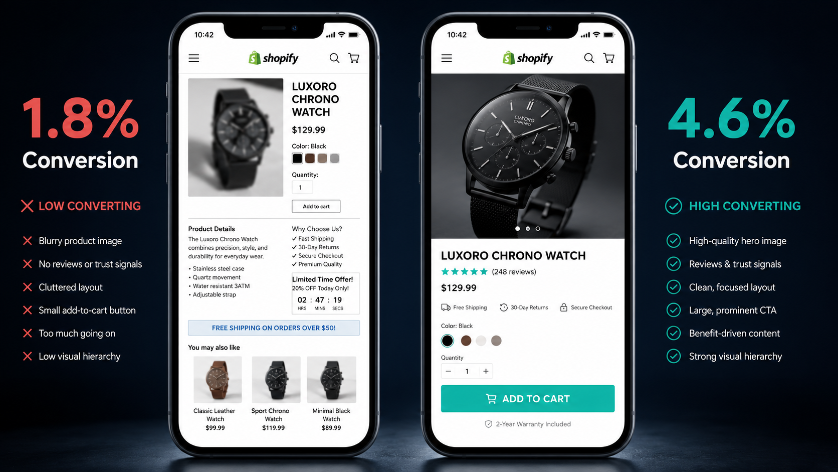
Most Shopify stores convert between 1 and 3% of product page visitors into buyers. Top-performing stores in competitive niches regularly hit 4 to 6%. Best-in-class direct-to-consumer brands reach 8% or higher on specific SKUs.
The gap between 1.8% and 2.7% does not sound dramatic. But if your store gets 10,000 monthly product page visitors at a $60 average order value, that 0.9 percentage point improvement generates an additional $5,400 per month — $64,800 per year — from zero additional traffic and zero additional ad spend. The math on product page optimization consistently delivers the highest ROI of any investment in your Shopify store.
The difference between average and excellent product pages is not clever design or expensive photography. It is deliberate execution of a set of well-documented elements that remove friction, build trust, and create a clear path to purchase. This guide covers every element that matters, in order of impact, with real brand examples showing each principle in practice.
Why Most Shopify Product Pages Underconvert
Before building the right product page, it is worth understanding exactly what is going wrong on the wrong ones. The causes of product page underperformance cluster consistently around the same six problems regardless of product category or store size.
Slow load times kill conversion before the page even renders. A product page that loads in 1.2 seconds converts approximately 40% better than the same page loading in 4.5 seconds. Every additional second of load time costs a compounding percentage of potential conversions — not because shoppers consciously decide the page is too slow, but because they bounce before the page finishes loading or because the frustration of waiting shifts their mental state away from purchase readiness.
Weak or insufficient imagery creates an imagination gap between the shopper and the product. Online shopping asks customers to buy something they cannot touch, try, or examine in person. The product page's job is to close that gap entirely through visual information — and pages with low-resolution, poorly lit, or insufficiently varied imagery cannot do it.
Buried calls to action mean that even motivated buyers cannot find the path to purchase. When the add-to-cart button is below the fold, visually indistinguishable from surrounding elements, or absent from mobile scroll positions, conversion drops simply because the next step is not obvious.
Missing trust signals leave purchase hesitation unanswered. A first-time visitor has no inherent reason to trust your store. Reviews, security badges, clear return policies, and visible contact information all reduce the perceived risk of purchase — and their absence amplifies it.
Poor product descriptions fail to answer the specific questions preventing purchase. Generic descriptions that list features without addressing the buyer's actual concern — will this fit my specific situation? — create the hesitation that sends shoppers to a competitor who answers the question better.
Checkout friction terminates purchases that the product page successfully initiated. A product page that converts to add-to-cart but loses the sale in checkout means the optimization problem extends beyond the page itself — and the two need to be treated as a connected conversion system.
The Anatomy of a High-Converting Shopify Product Page
The sequence of elements on a product page is as important as the elements themselves. High-converting product pages in 2026 follow a consistent structure that has been validated across thousands of A/B tests across the Shopify ecosystem.
The Above-the-Fold Zone: Everything Visible Without Scrolling
The above-the-fold zone is where the purchase decision is made or abandoned. On desktop, this typically encompasses the hero product image, product title, price, review count and rating, variant selector, and the add-to-cart button. On mobile — which accounts for 79% of Shopify traffic — the zone is narrower, and the priority order shifts accordingly.
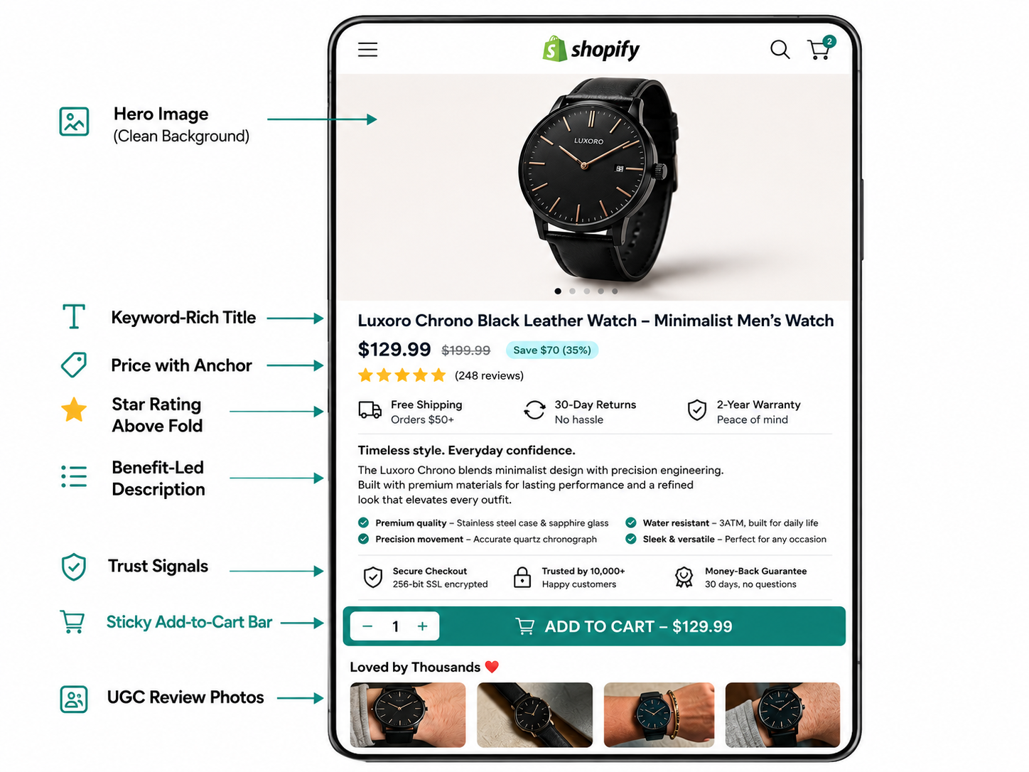
Everything in this zone must communicate one thing clearly: this is the right product, at a clear price, and buying it is the obvious next step.
The hero image earns the most real estate in this zone and should show the product on a clean background with enough resolution to zoom. Lifestyle images belong in the gallery that follows — not in the hero position. The first image answers the confirmation question every shopper has on landing: is this the right product? Lifestyle context before product clarity creates a moment of visual ambiguity that costs conversions.
Allbirds executes this flawlessly. Their product pages open with a large, clean product image on a neutral background, followed by benefit-led copy — "Light on your feet. Easy on the planet." — that simultaneously confirms the product and communicates the brand's value proposition. The price, size selector, and add-to-cart button appear immediately below without scrolling required on desktop.
Product Title: Keyword-First, Then Brand
Most Shopify stores write product titles for brand identity and lose SEO traffic in the process. The convention of naming products with creative brand language — "The Trailblazer" — makes the product impossible to find for a shopper who types "men's merino wool running socks" into Google.
Keyword-first product titles follow a simple formula: category descriptor first, then specific attributes, then brand name or style name last. "Merino Wool Running Socks — Crew Length — Men's" will rank for the searches your customers actually make. Brand names only generate search demand after years of marketing investment. Keyword titles capture demand from day one.
The title should be clear enough that a customer who skimmed past the image can read it and immediately confirm they are on the right product page.
Pricing: Visible, Honest, and Psychologically Calibrated
Price should appear immediately below the title, in a font size and weight that makes it impossible to miss. The specific psychological principle worth implementing here is anchoring — when a product has a sale price, showing the original price alongside creates a reference point that makes the current price feel like an obvious deal. "Was $99, now $79" registers as genuine value in a way that "$79" in isolation does not, because the brain compares the current price to the anchor rather than to an internal reference.
For products with price variation across variants — sizes, materials, subscription tiers — show the starting price at the top level and update it dynamically as variants are selected. A price that changes unexpectedly when a customer selects their size creates a trust disruption at a critical moment. Dynamic price display prevents the surprise without requiring the customer to navigate away.
Social Proof: Above the Fold, Not Below the Description
The positioning of reviews on a product page has more impact on conversion than the content of the reviews themselves. Reviews placed below the product description — where most Shopify themes default to putting them — are seen by fewer than 50% of product page visitors. Reviews placed in the above-the-fold zone, showing a star rating and review count immediately beneath the product title, are seen by essentially every visitor.
The placement principle: review count and star rating belong in the above-the-fold zone, adjacent to the product title or price. Full review content belongs lower on the page for shoppers who scroll to read in detail.
Dollar Shave Club demonstrates this well — their product pages feature a large star rating and review count directly beneath the product name, before the price even appears. The social proof arrives at the exact moment a new visitor is forming their first impression of the product.
The review content that most influences conversion is not five-star praise — it is specific, detailed reviews that address the exact concerns a potential buyer has. Reviews that mention fit, durability, specific use cases, or comparisons to alternatives answer the questions that would otherwise send a shopper to Google for more research.
User-generated content photos — real customers showing the product in use — have a disproportionate conversion impact because they answer the implicit question that product photography cannot: what does this actually look like in real life? UGC embedded in the review section or gallery increases conversion rates by up to 28%.
Product Gallery: Six to Eight Images Covering Every Purchase Question
The gallery should answer every visual question a motivated buyer has before purchase. The minimum gallery for a physical product in 2026 includes: hero product image on clean background, multiple angles showing all sides and details, scale reference showing the product in use or next to a familiar object, lifestyle context showing the product in its natural environment, variant images for every color and finish option, and detail shots of materials, texture, or construction relevant to the purchase decision.
For apparel and fashion, on-model images covering multiple body types where possible significantly reduce size-related return rates because they answer the fit question more honestly than a single model with a perfect sample-size fit. Rebecca Minkoff implemented this approach alongside 3D product visualization and saw visitors who interacted with multi-angle views convert at 44% higher rates than those who saw only standard photography.
Video in the gallery — even a 20 to 30 second product demonstration clip — consistently increases time on page and conversion rate. Video gives shoppers dynamic product information that still photography cannot convey: how a fabric moves, how a product functions, how large it actually is in context. If your gallery currently contains no video, adding a single short demonstration clip is one of the highest-ROI gallery improvements available.
Product Description: Benefits First, Specifications Second
The structure of a product description matters as much as its content. High-converting descriptions lead with the customer benefit, establish the specific problem the product solves, then deliver the features and specifications that substantiate the benefit claim.
The failing structure: "Made with premium grade 18-8 stainless steel, this 24oz double-wall vacuum insulated water bottle features a BPA-free lid and powder coat finish."
The converting structure: "Keeps your water cold for 24 hours and coffee hot for 12 — so your drink is still exactly the temperature you want it when you reach the bottom. Made with premium 18-8 stainless steel with a double-wall vacuum seal and BPA-free lid."
The second version leads with what matters to the buyer — the experience — and uses the features to support that claim. The first version leads with manufacturing details that most buyers cannot evaluate and do not initially care about.
Description length should match the purchase decision complexity. A $15 accessory does not require 500 words. A $300 piece of fitness equipment probably does, because shoppers making higher-consideration purchases need more information to feel confident enough to buy. Match depth to decision weight.
Format descriptions for scanning rather than reading. Buyers rarely read product descriptions linearly — they scan for the specific information they need to confirm their decision. Bullet points for key benefits, short paragraphs for narrative context, and collapsible accordions for detailed specifications keep the page clean while making information findable.
The Add-to-Cart Button: Visible, Persistent, and Unambiguous
The add-to-cart button should be the most visually dominant element on the page below the hero image. It needs a color that contrasts clearly with the page background — not a muted neutral that blends into the design — and a size that is unmistakably tappable on mobile screens.
Button copy matters more than most merchants realize. "Add to Cart" is the industry standard and performs consistently well because it is unambiguous. Testing alternatives like "Get Yours," "Add to Bag," or product-specific copy such as "Start Your Trial" occasionally outperforms the standard — and A/B testing these on your highest-traffic product pages is a low-effort, potentially high-reward optimization.
On mobile, the single highest-impact product page change available to most stores is a sticky add-to-cart bar — a persistent button that remains visible as the shopper scrolls through product details, reviews, and specifications. Stores implementing sticky ATC bars see 12 to 18% higher mobile conversion rates because the purchase action is never more than one tap away regardless of scroll position.
Alongside the ATC button, express checkout options — Shop Pay, Apple Pay, Google Pay — should appear either above or directly below the primary button. These allow returning customers to bypass the form-filling process entirely and convert with a single tap. The conversion rate lift from express checkout options on product pages ranges from 5 to 10% depending on the proportion of returning customers in your traffic mix.
Trust Signals: Answering the Risk Question
A first-time visitor to your store has no reason to trust you with their payment information and shipping address. The job of trust signals is to reduce perceived risk at the exact moment the visitor is deciding whether to buy.
The four trust signals with the highest conversion impact are a prominently displayed return policy, a secure checkout badge near the payment area, visible contact information or customer service availability, and social proof from reviews and customer counts.
The return policy in particular deserves prominent placement on the product page itself — not buried in the footer, not accessible only through a link. A "Free returns within 30 days" statement close to the add-to-cart button reduces purchase hesitation more than almost any other single element, because it makes the risk of a wrong decision reversible.
MVMT Watches places their trust elements directly below the add-to-cart button: free shipping threshold, return window, and a security badge — all visible without scrolling on desktop. The sequencing is intentional: show the product, provide the reason to buy, then address the reason not to buy immediately adjacent to the purchase button.
Page Speed: The Invisible Conversion Killer
Every product page optimization exists on top of a foundation of page speed. An optimized page that loads slowly will consistently underconvert a non-optimized page that loads quickly. Speed is the multiplier on everything else.
Run Google PageSpeed Insights on your five highest-traffic product pages and note your Largest Contentful Paint (LCP) score — the time to when the main product image is visible. The target is under 2.5 seconds. Pages scoring above 4 seconds lose a compounding percentage of potential buyers to patience failure before any conversion element has a chance to work.
The most common speed bottlenecks on Shopify product pages are unoptimized product images, which account for the majority of page weight on most stores. Convert all product images to WebP format — 25 to 35% smaller than JPEG at equivalent quality — and implement lazy loading so images only load when they enter the viewport. These two changes alone typically reduce product page load time by 30 to 50% on image-heavy stores.
App JavaScript is the second major culprit. Every Shopify app installed adds JavaScript to your storefront regardless of whether that app is used on the specific page loading. Audit your installed apps and remove any that are not actively generating revenue. For apps you keep, use a tool like Shopify's Theme Inspector to identify which apps are adding the most JavaScript weight to your product pages.
Target LCP under 2.5 seconds and Cumulative Layout Shift (CLS) under 0.1 on mobile as your performance baseline. Product pages meeting these thresholds convert at significantly higher rates than those that do not, and Google's Core Web Vitals algorithm rewards them with better organic search rankings that bring in more of the traffic you are optimizing to convert.
Mobile Product Page Optimization: The Priority Above All Others
79% of your product page traffic arrives on a mobile device. Optimizing for desktop first and mobile second means optimizing for the minority of your visitors. In 2026, mobile-first is not a preference — it is the only rational design priority for Shopify product pages.
The mobile product page layout principles that most directly drive conversion are:
Hero image fills the screen width without horizontal overflow or clipping. The product should be immediately visible on the device's natural viewport without any scrolling or zooming required.
Price and rating are visible within the first scroll position on mobile — ideally before the first scroll is required. Shoppers on mobile make faster decisions than desktop users and are less patient with pages that require navigation to find basic purchase information.
All tap targets meet the 48 by 48 pixel minimum size. Buttons, variant selectors, accordion triggers, and navigation elements that are too small to tap accurately on a thumb-operated device create micro-frustrations that compound into abandonment.
Collapsible accordions for secondary information — detailed specifications, shipping information, full-length description — keep the mobile page clean and scannable without hiding information that motivated buyers need. The default state should show key benefits and buying information; details live behind an expand tap that interested shoppers will use without it cluttering the experience for those who do not need it.
Test your product pages on actual devices — at least one iPhone and one Android device of average screen size — not browser emulation. Emulation does not replicate real scroll behavior, tap responsiveness, or the true above-the-fold viewport. You will find friction in five minutes of real device testing that months of desktop optimization never surfaces.
Variant Selection: The Most Underoptimized Element
Variant selectors — the interface that lets customers choose size, color, material, or style — are responsible for a quietly significant source of product page abandonment. Poor variant UX creates selection friction that causes shoppers to either choose incorrectly (leading to returns) or give up and leave (leading to lost sales).
The principles of high-converting variant selection are:
Show color and material variants as visual swatches, not dropdown menus. A dropdown that says "Forest Green" requires imagination. A color swatch shows the customer exactly what they are selecting with zero ambiguity.
Mark out-of-stock variants visually — typically with a strikethrough or a diagonal line through the swatch — rather than hiding them or allowing selection that leads to an "add to cart" error. Customers who select a size and hit an error lose trust immediately. Customers who can see at a glance which variants are unavailable make faster decisions and feel more informed.
Update the hero image dynamically when a color or material variant is selected. Selecting "Midnight Blue" and having the hero image remain on the "Cream" colorway shown by default creates a visual disconnect that introduces purchase uncertainty. The gallery should reflect the exact product the customer is about to buy.
For size-sensitive products, a size guide accessible directly from the variant selector — not from a separate page or footer link — reduces the size abandonment that drives both non-purchase and return rates. The goal is answering the size question without sending the customer away from the product page to find the answer.
Social Proof Beyond Reviews: UGC, Badges, and Press
Reviews are the most important social proof element on a product page, but they are not the only one. The most effective product pages in 2026 layer multiple social proof signals that together build a picture of a trusted, popular product.
Purchase count or customer count displays — "1,247 people bought this last month" or "Join 50,000+ happy customers" — create bandwagon social proof that is particularly effective for high-traffic pages where the volume is genuinely impressive. Shopify apps including Fomo and Social Proof Sales Pop display these counts automatically with real order data.
Press mentions and media logos — "As seen in Forbes, Vogue, The Times" — carry authority transfer value that customer reviews cannot replicate. A badge from a recognized publication tells shoppers that third parties with editorial standards found the product worth featuring. Even a single credible press mention displayed prominently on your product page contributes meaningfully to first-purchase conversion from new visitors.
Certifications and awards — organic certification, B Corp status, industry awards — serve as third-party validation signals for buyers who care about product quality or ethics. Tentree and Allbirds both display their sustainability certifications prominently on product pages because their target customers specifically seek out this type of third-party validation before purchasing.
Product Page SEO: Converting Organic Traffic You Have Not Yet Earned
Organic search traffic that lands directly on product pages is the highest-intent traffic your store will ever see — the visitor searched for exactly what you sell and clicked on your result. Product page SEO that captures this traffic is compounding: once you rank, the traffic and conversions continue without additional ad spend.
Product page SEO in 2026 requires keyword-rich titles following the formula covered earlier, a meta description that functions as an ad for the page (including the primary keyword and a benefit-forward reason to click), product schema markup that enables rich snippets showing your star rating directly in Google search results, original product descriptions that do not duplicate manufacturer copy (which competes with thousands of other stores using the same text), and page speed that meets Core Web Vitals thresholds (which Google uses as a ranking signal directly).
The product schema markup point deserves emphasis because it has the most visible impact on search result appearance. A product page with correctly implemented schema shows star ratings, review count, price, and availability directly in the search result before a visitor clicks. This rich result consistently generates higher click-through rates than standard blue link results for the same ranking position.
A/B Testing: The Systematic Path to Continuous Improvement
No product page is finished. Every product page is a hypothesis about what will convert the specific visitors arriving at that page — and that hypothesis improves when tested against the actual behavior of real shoppers.
The elements worth testing systematically on high-traffic product pages are: hero image (product-on-white vs. lifestyle), add-to-cart button color and copy, review placement (above vs. below description), price presentation (with vs. without comparison price), product title format (keyword-first vs. brand-first), and description structure (benefits-first paragraph vs. bullet-point list vs. hybrid format).
The discipline of testing one variable at a time is non-negotiable. Multi-variable tests produce results that cannot be attributed to specific changes, which makes the data useless for informing future decisions. Test one meaningful element, run the test until you have statistical significance across at least 200 to 400 conversions per variant, declare a winner, implement it, and move to the next variable.
Shoplift is the A/B testing tool built specifically for Shopify that handles theme duplication and traffic splitting natively without requiring developer integration. Convert Experiences is the enterprise standard with stronger Shopify integration than most third-party testing platforms. Either provides the infrastructure needed to run disciplined product page testing.
Start with your five highest-traffic product pages — the ones generating the most organic and paid traffic. A conversion improvement on a page receiving 5,000 monthly visitors generates 10 times the revenue impact of the same improvement on a page receiving 500 visitors. Prioritize testing by traffic volume and let the math guide your optimization sequence.
The Product Page Audit Checklist
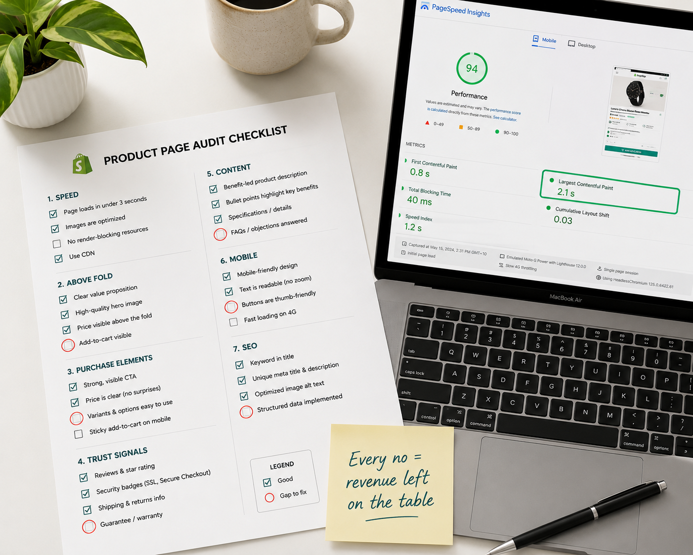
Before investing in new features or redesigns, audit your current product pages against this checklist. Every "no" answer is an optimization opportunity ordered by the impact framework above.
Speed and technical foundation: Does the product page load in under 2.5 seconds on mobile? Are all images in WebP format with lazy loading? Is the LCP under 2.5 seconds and CLS under 0.1?
Above-the-fold elements: Is the hero image clean, high-resolution, and product-first? Is the title keyword-rich and immediately descriptive? Is the price clearly visible without scrolling on both desktop and mobile? Is the review rating and count visible in the above-the-fold zone?
Purchase elements: Is the add-to-cart button visually dominant with a high-contrast color? Is there a sticky add-to-cart bar on mobile? Are express checkout options (Shop Pay, Apple Pay) available on the product page? Are variant selectors shown as visual swatches rather than dropdowns where applicable?
Trust and social proof: Is there a return policy statement adjacent to the add-to-cart button? Are security badges visible near the purchase area? Is there a customer count or social proof metric visible without scrolling?
Content: Does the description lead with customer benefit rather than product specifications? Is gallery coverage complete across all angles, variants, and use cases? Is there at least one video in the gallery?
Mobile: Have you tested this page on an actual iPhone and Android device? Are all tap targets 48 by 48 pixels minimum? Is the above-the-fold zone showing product, price, and rating without the first scroll?
SEO: Is product schema markup implemented correctly? Does the meta description include the primary keyword and a reason to click? Is the product description original rather than duplicated from manufacturer copy?
Final Thoughts
A high-converting Shopify product page is not the result of a clever design idea or an expensive redesign. It is the result of deliberate execution of elements that are well understood and extensively documented — applied consistently across your catalog and continuously improved through testing.
The stores consistently converting at 4 to 6% are not doing anything exotic. They have fast pages. They have complete imagery. Their trust signals are prominent. Their mobile experience is designed for thumbs. Their add-to-cart button is impossible to miss. And they are testing changes systematically rather than redesigning by intuition.
Start with the audit checklist above. Every "no" answer is revenue you are currently leaving on the table from traffic you are already paying for.
Need help optimizing your Shopify product pages for conversion, or want an expert to audit your top-performing pages for friction and opportunity? Get in touch with EcomFixify — we specialize in Shopify development and conversion rate optimization for growing brands.