
How to Build a Professional Shopify Store in One Day
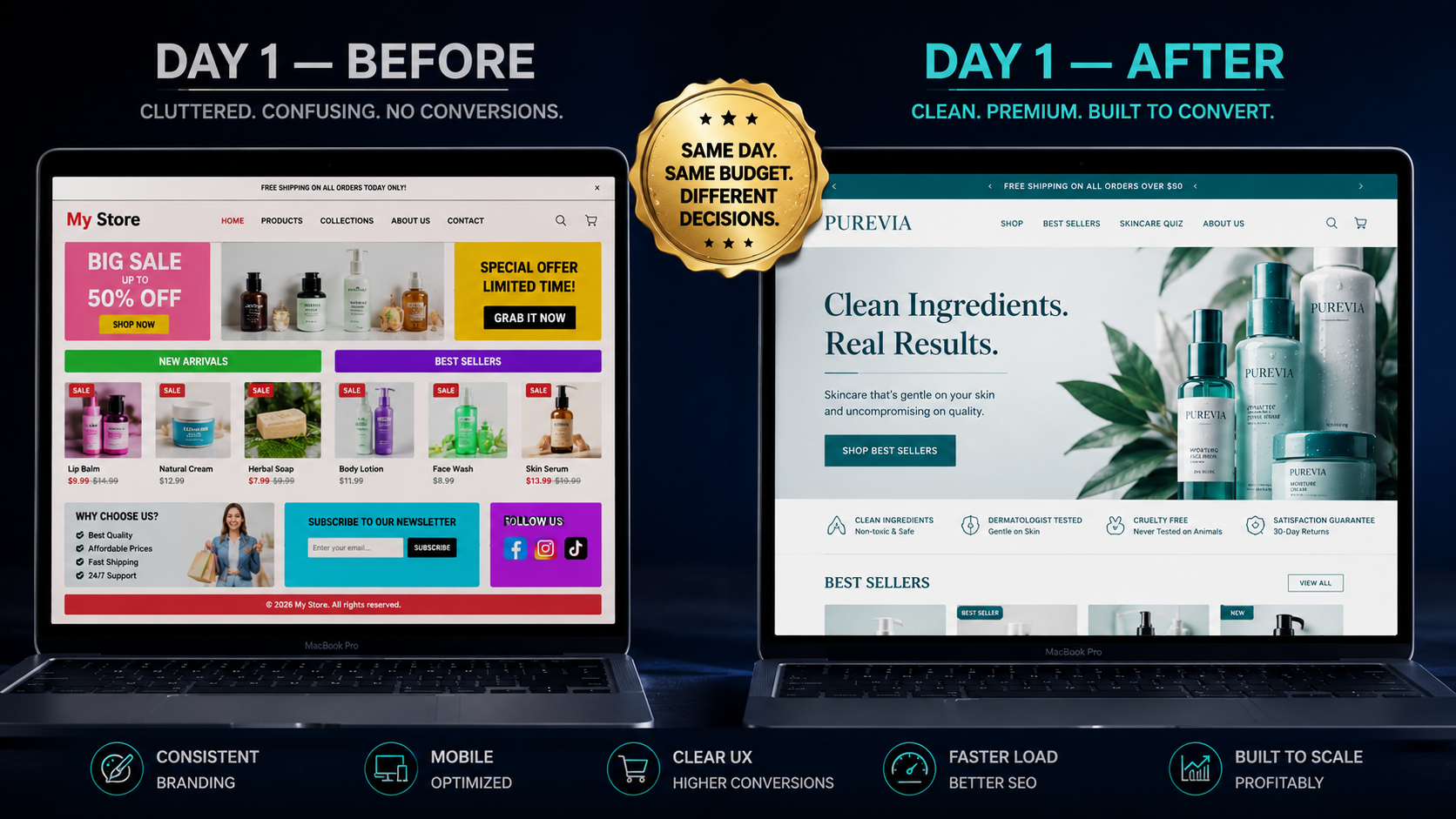
The most common reason new Shopify stores fail before they get a chance to succeed has nothing to do with their product, their price, or their marketing. It has to do with trust. A visitor lands on the store, spends four seconds looking at it, and leaves — because it looks like it was built in an afternoon by someone who had never designed anything before. How to Build a Professional Shopify Store in One Day
Here is the irony: in 2026, a store that looks like it was built in an afternoon by someone who had never designed anything before and a store that looks like a premium DTC brand worth millions of dollars can both be built in a single day. The difference is not time or money. It is the specific decisions made during that day.
The visual signals that tell a visitor "this is a real brand worth buying from" and the signals that tell them "this looks untrustworthy" are well-documented and consistently identifiable. A clean color palette, a single consistent font pair, high-quality product imagery, deliberate whitespace, a structured homepage hierarchy, and the right trust signals in the right places — these are the design decisions that separate stores converting at 4% from stores converting at 0.8%.
This guide walks you through every decision, in the order you should make it, to build a Shopify store in one day that looks like a brand customers trust, remember, and buy from.
Before You Open Shopify: The 30-Minute Brand Foundation
The most common mistake new merchants make is opening Shopify and starting to design before they have made any brand decisions. The result is a store built around the theme's default colors, whatever logo they found on Canva in five minutes, and font choices made by gut feel with no coherent system.
A brand foundation takes 30 minutes to define and transforms every subsequent design decision from a guess into a deliberate choice.
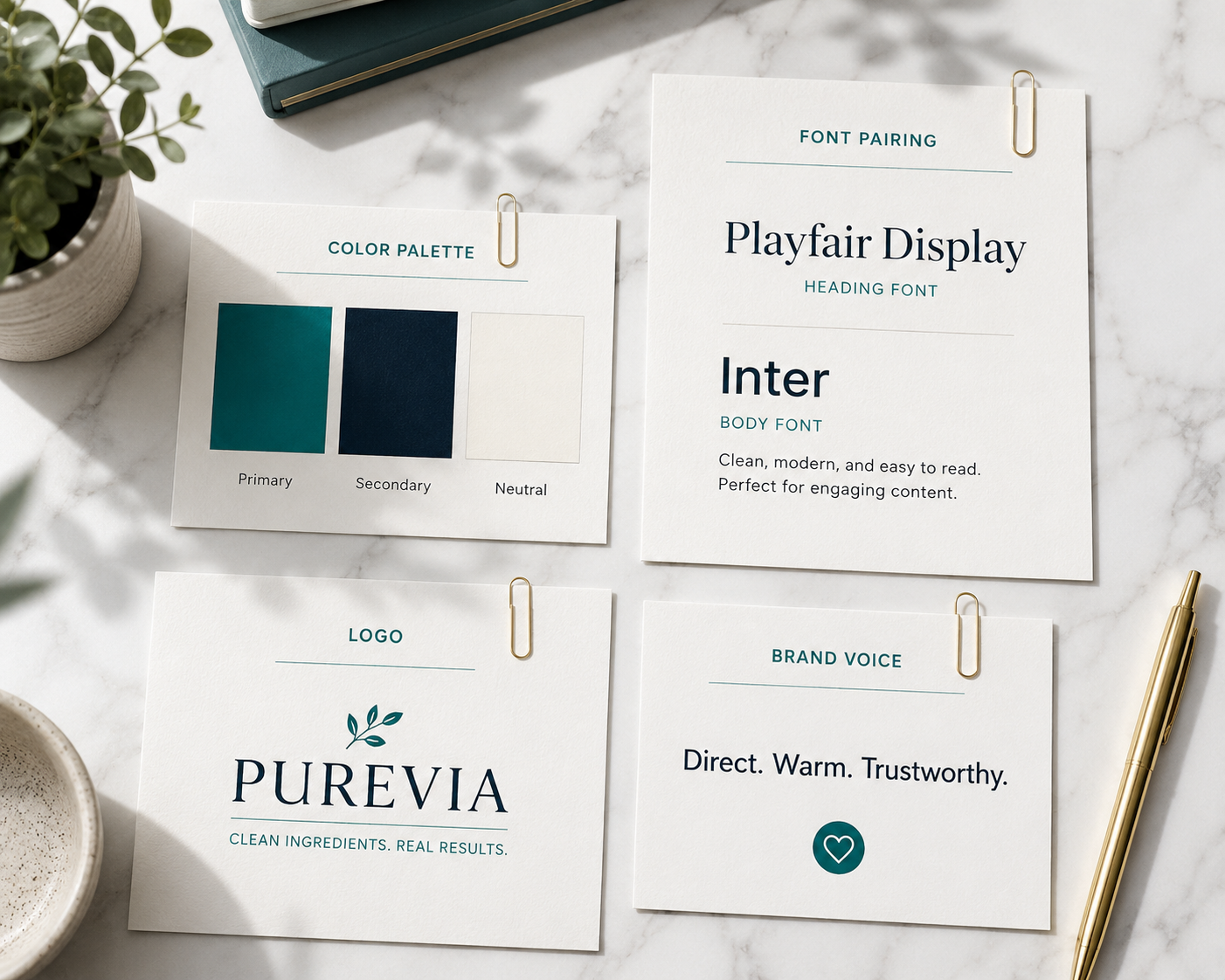
Your color palette: choose three colors — a primary, a secondary, and a neutral. Your primary color is the dominant brand color that appears on buttons, accents, and key visual elements. Your secondary color provides contrast and depth. Your neutral is typically a near-white or light grey that serves as the primary background.
The color decisions that consistently signal premium in ecommerce are restrained palettes with high contrast and deliberate application. The stores that look expensive use fewer colors, not more. Two to three colors applied consistently throughout a store creates visual coherence that feels designed. Five or six colors used inconsistently creates visual noise that feels amateur.
For color selection without a graphic design background, use Coolors.co to generate harmonious palettes based on your primary color, or reference the brand palettes of premium brands in your category for directional guidance. You are not copying — you are understanding what color combinations your target market already associates with quality in your product space.
Your font pair: choose two fonts — a display font for headings and a body font for everything else. One of the fastest ways to make a Shopify store look expensive is to use a serif display font for headlines paired with a clean sans-serif for body text. The combination signals craft, intentionality, and confidence — which is why virtually every premium DTC brand uses some variation of this pairing.
Google Fonts provides hundreds of free options. Reliable pairings that consistently read as premium: Playfair Display or Cormorant Garant for headings paired with Inter, Lato, or DM Sans for body copy. Restrict yourself to two fonts maximum — three or more creates typographic inconsistency that visually fragments the brand.
Your brand voice in one sentence: write down one sentence describing how your brand sounds — the tone and personality that should come through in every headline, product description, and button label. "Direct, warm, and knowledgeable" produces different copy than "playful, inclusive, and irreverent." Having this defined before you write a single word of store content keeps every text element tonally consistent.
Hour 1: Choosing and Installing the Right Theme
Your theme is not your brand — it is the framework your brand lives inside. The goal in theme selection is to find a framework that requires the fewest compromises and the least customization to get close to your vision.
The best Shopify themes in 2026 for a professional one-day build are:
Dawn — Shopify's flagship free theme and the most widely recommended starting point in 2026. Clean, fast, mobile-optimized, and built on Online Store 2.0 architecture. Its minimalism is a feature rather than a limitation — blank space communicates premium when used deliberately, and Dawn's lean layout gives your products and brand identity room to breathe without competing for attention. If budget is a constraint, Dawn executed well consistently outperforms expensive premium themes executed poorly.
Impulse — a premium theme at $380 that is worth the investment for brands with strong visual identity and larger product catalogs. Its promotional and storytelling sections — hero banners, lifestyle collections, and testimonial layouts — are more sophisticated than Dawn's out-of-the-box, reducing the customization required to achieve a premium aesthetic.
Prestige — the go-to premium theme for beauty, fashion, and lifestyle brands positioning above the mid-market. Its editorial design system, full-screen imagery support, and refined typography handling make it the natural choice for brands whose visual identity relies on large, impactful imagery.
Dawn with customization is the recommendation for a one-day build. It installs in minutes, performs excellently out of the box, and the time saved on setup can be redirected toward the higher-impact design decisions covered below.
To install: from your Shopify admin, go to Online Store → Themes → Explore Free Themes (for Dawn) or Visit the Theme Store (for premium options). Install your chosen theme and immediately go to Customize to begin configuration.
Hour 2: Color, Typography, and Logo Implementation
This is where your brand foundation decisions translate into the actual store. Open the theme customizer, navigate to Theme Settings, and work through these in order.
Colors: input your exact hex codes for primary, secondary, and neutral colors. Apply them consistently — your primary color goes to buttons, links, and key accent elements. Your neutral goes to all backgrounds. Your secondary color is used sparingly for contrast elements and hover states. Any deviation from this system — a button in a color you have not defined, a background shade that is slightly different from your neutral — creates visual inconsistency that experienced shoppers register as unprofessional even if they cannot articulate why.
Typography: select your chosen font pair in the typography section. Set your heading font size hierarchy carefully — your H1 should be noticeably larger than H2, which should be noticeably larger than H3. The visual hierarchy between heading levels is what creates a sense of structure and order on every page. Flat heading sizing — where H1, H2, and H3 are similar sizes — makes pages feel undifferentiated and hard to scan.
Set your body font to a size between 16 and 18 pixels. Body text below 15 pixels forces mobile readers to zoom in, which is an immediate UX failure. Body text above 19 pixels can feel oversized and wastes vertical space. The 16 to 18 pixel range is the standard that reads comfortably at arm's length on a smartphone screen.
Logo: if you have a professionally designed logo, upload it now. If you do not, use Shopify's built-in logo maker or Canva to create a text-based wordmark using your heading font in your primary color. A clean wordmark — your brand name set in your display font at an appropriate weight — consistently outperforms a poorly designed icon-based logo. The biggest mistake in logo design for new Shopify stores is complexity. Simple is memorable. Complicated is forgettable.
Set your favicon — the small icon that appears in browser tabs — to a simplified version of your logo or a single initial. This is a detail most new merchants overlook, and its absence makes a store look unfinished to detail-conscious shoppers.
Hours 3 and 4: Homepage Architecture That Sells
Your homepage is not a portfolio of everything your store offers. It is a structured sequence of sections that guides a first-time visitor from initial impression through product discovery to the first conversion decision — in the shortest possible path.
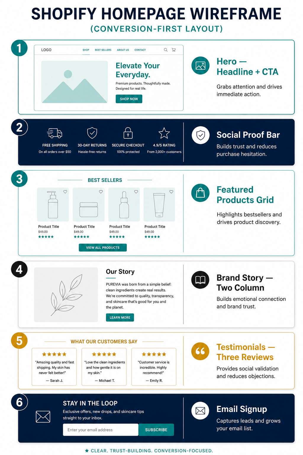
The section hierarchy that consistently converts in 2026:
Hero section — full-width, above the fold, immediately visible on page load. A single compelling headline that communicates your brand's core promise in eight words or fewer. A subheadline of one or two sentences that adds context. A single primary CTA button in your primary color that links to your bestselling collection or product. A high-quality background image or autoplay video that shows the product in use or evokes the lifestyle your brand represents.
The headline is the most important copy element on your entire store. It should answer the question "why should I buy from this brand?" in a single line. "The cleanest skincare for sensitive skin" answers that question. "Welcome to our store" does not.
Social proof bar — a horizontal strip immediately below the hero with three to four trust indicators: "Over 10,000 happy customers," "Free returns," "Rated 4.9 stars," or press logos if your brand has been featured anywhere. This section appears before the visitor has seen a single product, which is exactly when it does the most work — it answers the legitimacy question before it can form.
Featured collection or product — your bestselling products presented in a clean three or four column grid with product images, titles, prices, and a quick-add button. This section should show your five to eight best products — not your entire catalog. Presenting too many products at once creates decision paralysis and increases bounce rate.
Brand story or values section — a two-column layout with a lifestyle image on one side and a short brand story on the other. Three to four sentences maximum. This section addresses the "who is behind this brand?" question that builds emotional connection beyond product features. Brands that show the human behind the store convert first-time visitors at higher rates because trust is built on connection as much as product quality.
Testimonial section — three featured reviews with star ratings, customer names, and specific product references. The specificity of testimonials — "the moisturiser changed my skin in two weeks" rather than "great product" — is what makes them persuasive. Curate your most specific, results-oriented reviews for this placement.
Secondary collection or product highlight — a second product feature for a different collection or a complementary product category. This extends the visitor's product discovery without requiring them to navigate to a collection page.
Email signup section — a clean, minimal signup with a single field, a benefit-oriented headline — "Join 8,000 subscribers for exclusive offers and first access to new products" — and a button in your primary color. Positioned near the bottom of the homepage where visitors who have scrolled through the full experience are your highest-intent audience for list building.
Hours 5 and 6: Product Pages and Essential Store Pages
With the homepage complete, shift attention to product pages — which is where the purchase decision is actually made.
Follow the product page architecture covered in the EcomFixify guide to high-converting product pages: hero image above the fold, title and star rating in H1, price displayed prominently, sticky Add to Cart button on mobile, benefit-driven description, trust signals near the ATC button, and FAQ section addressing the most common pre-purchase questions.
The product page elements that most directly communicate premium brand status in 2026 are image quality and description depth. If your product images are inconsistently lit, different sizes, or mixed between professional and amateur shots, the page reads as unfinished regardless of how well-designed every other element is. Consistency in your product photography — same background, same lighting, same aspect ratio across every SKU — is the single most impactful product page investment available to a new store.
For product descriptions: two paragraphs maximum for the emotional opener, followed by a clean bullet list of specifications. Use your brand voice consistently — if your voice is direct and warm, every product description should feel direct and warm. If a customer read three of your product descriptions in a row, they should feel like the same person wrote all three.
Essential pages to build on day one:
About page — your brand story in three to four paragraphs, covering why you started the brand, what problem you are solving, what makes your products different, and who is behind the brand. Include a photo of yourself or your team if you are comfortable doing so. Stores with visible founders consistently build trust faster than faceless brands.
Contact page — a contact form, your support email address, and your expected response time. "We typically respond within 24 hours" is a trust signal. No contact information is a conversion killer for first-time visitors who are evaluating whether you are a real business.
Shipping and returns page — your shipping timeline, carriers, costs, and your return policy written in plain language. Every visitor who lands on this page is a high-intent visitor deciding whether the purchase risk is acceptable. Make the policy generous, clear, and easy to find.
Privacy policy and terms of service — Shopify generates these automatically for your store type. Go to Settings → Legal → Generate from template. These are legal requirements in most jurisdictions and their absence signals to sophisticated shoppers that the store is incomplete.
Hour 7: Trust Signals and Final Pre-Launch Details
The final hour before launch addresses the details that separate a store that feels finished from one that feels like it is still being built.
Favicon — confirm it is showing your simplified logo or initial in browser tabs.
Navigation — your main menu should show no more than five to six items. The most common navigation items that convert are your main product categories, About, and a link to contact or support. Remove any placeholder links that Shopify adds by default — "Catalog," "Home" — that appear in demo navigation menus.
Footer — the footer is the last impression your store makes on every page. It should contain your navigation links organized by category, your contact email, links to your social profiles, your payment method icons, and your privacy and terms links. A complete, organized footer signals that the store is professionally operated.
Payment icons — enable Shopify Payments, Shop Pay, Apple Pay, and Google Pay in your Settings → Payments. These payment method logos appearing in your footer and on the checkout page signal transaction security to first-time buyers who are assessing risk.
Mobile review — open your store on a real smartphone and click through the homepage, a product page, the cart, and the checkout initiation. You will notice layout issues, font size problems, and button placement friction points within five minutes of a real device test that no desktop preview will reveal. Fix every issue you find before publishing.
Test order — place a test order through your own store using Shopify's test payment gateway before going live. Confirm the order confirmation email arrives correctly, that inventory is decremented, and that the checkout flow is smooth from cart through order completion.
The Design Mistakes That Make New Shopify Stores Look Amateur
Understanding what to avoid is as important as understanding what to build. These are the specific design decisions that most commonly undermine the professional impression of new Shopify stores in 2026.
Inconsistent photography is the fastest way to make a polished theme look unfinished. Mixing professional white-background shots with casual phone photos taken in different lighting conditions on the same page tells visitors the store is not ready for business.
Too many fonts destroy brand coherence. Themes allow multiple font selections, but restraint is the correct approach. Two fonts — one for headings, one for body — applied consistently throughout the store creates visual unity. Three or more fonts creates visual chaos.
Using the theme's default demo colors without customization makes your store look identical to thousands of other stores using the same theme. The first customization action after installing any theme should be replacing the default color palette with your own.
Missing or thin product descriptions signal low effort to customers and low relevance to Google. A product description that is one sentence long does not give a first-time buyer enough information to convert and does not give a search engine enough content to rank the page.
No social proof above the fold means the first thing visitors see is your products without any validation from other buyers. The social proof bar beneath the hero section — even just star ratings and review count — addresses the legitimacy question before it can become a barrier.
Broken links, placeholder text, or "Coming Soon" pages that are still visible signal a store that has not been finished. Before going live, click every link in your navigation menu and footer to confirm they lead somewhere real.
What One Day of Disciplined Execution Actually Delivers
Following this framework in a single day produces a store with a coherent, consistent brand identity; a conversion-optimized homepage that guides visitors toward purchase; product pages with the visual hierarchy, social proof, and trust signals that professional buyers expect; and a complete set of supporting pages that answer every question a first-time visitor might have.
That is not a starter store to iterate away from. That is a store worth launching — one that competes visually with brands that have been building their identity for years, because the decisions that create visual premium are not expensive or time-consuming. They are disciplined.
The brands that look like million-dollar operations are not necessarily spending a million dollars. They are making consistent, deliberate design choices and applying them without deviation across every page, every section, and every customer touchpoint. That consistency is what trust looks like. And trust is what converts.
Need help designing or rebuilding your Shopify store to a professional standard, or want an expert to audit your current store design for conversion gaps? Get in touch with EcomFixify — we specialize in Shopify development and store design for brands serious about growth.